News and Lifestyle from the LYM Lab


cfDNAanalyzer


22 April 2025

Table of Contents

Section 1: Visualization for the extracted features

cfDNAanalyzer can extract a variety of features. In this section, we have visualized these features to help users better explore the full landscape of cfDNA characteristics.

Section 1.1: Copy Number Alterations (CNA)

In this part, we will visualize the file /Features/CNA.csv in the output directory.

Library the neccesary packages
library(ggplot2)
library(tidyr)

Load data and extract mean CNA value of every group

To begin, we load the Copy Number Alterations data from output directory and transform it.

raw_data = read.csv("/ouput_directory/Features/CNA.csv")
raw_data <- as.data.frame(t(raw_data))
colnames(raw_data) <- raw_data[1, ]
raw_data <- raw_data[-1, ] 

Following that, we divide the cancer and healthy samples according to rowname label.

label_row <- unlist(raw_data["label", ])

cancer_cols <- which(label_row == 1)
df_cancer <- raw_data[rownames(raw_data) != "label", cancer_cols, drop = FALSE]

healthy_cols <- which(label_row == 0)
df_healthy <- raw_data[rownames(raw_data) != "label", healthy_cols, drop = FALSE]

Next, we extract the mean value in cancer and healthy group.

df_cancer <- type.convert(df_cancer, as.is = FALSE)
df_cancer$average <- rowMeans(df_cancer,na.rm = TRUE)

df_healthy <- type.convert(df_healthy, as.is = FALSE)
df_healthy$average <- rowMeans(df_healthy,na.rm = TRUE)

Once this is completed, we create chr, start, endcolumn from rownames.

df_cancer$region <- rownames(df_cancer)          
rownames(df_cancer) <- NULL                       
df_cancer <- separate(df_cancer, region, into = c("chr", "start", "end"), sep = "_")
df_cancer$chr <- sub("^.", "", df_cancer$chr)
df_cancer = df_cancer[,c("chr","start","end","average")]

df_healthy$region <- rownames(df_healthy)          
rownames(df_healthy) <- NULL                       
df_healthy <- separate(df_healthy, region, into = c("chr", "start", "end"), sep = "_")
df_healthy$chr <- sub("^.", "", df_healthy$chr)
df_healthy = df_healthy[,c("chr","start","end","average")]

Afterward, we eliminate the X chromosome and convert the data in the start and end columns to numeric values while sorting the entire data frame.

df_healthy <- df_healthy[df_healthy$chr != "X", ]
df_healthy$chr <- as.numeric(df_healthy$chr)
df_healthy$start <- as.numeric(df_healthy$start)
df_healthy <- df_healthy[order(df_healthy$chr, df_healthy$start), ]

df_cancer <- df_cancer[df_cancer$chr != "X", ]
df_cancer$chr <- as.numeric(df_cancer$chr)
df_cancer$start <- as.numeric(df_cancer$start)
df_cancer <- df_cancer[order(df_cancer$chr, df_cancer$start), ]

We then add specific symbol columns to the data frame.

df_healthy$combine <- 1:nrow(df_healthy) 
df_healthy$sample <- "Healthy"
df_healthy$condition <- "Healthy"
df_healthy$color <- "blue"

df_cancer$combine <- 1:nrow(df_cancer) 
df_cancer$sample <- "Cancer"
df_cancer$condition <- "Cancer"
df_cancer$color <- "red"

Find the different regions

We begin by merging the healthy and cancer data frames together and sorting the combined data.

df_all = merge(df_cancer,df_healthy,by = c("chr", "start", "end"))
df_all <- df_all[order(df_all$chr, df_all$start), ]

We then identify the regions that exhibit significant differences between the healthy and cancer samples, altering the color of these regions accordingly.

df_all$diff <- df_all$average.x / df_all$average.y
df_all$color <- ifelse(df_all$diff >= 1.5 | df_all$diff <= 2 / 3 , "green", "blue")
healthy_color = df_all$color
cancer_color <- ifelse(healthy_color == "blue", "red", healthy_color)
color = c(cancer_color,healthy_color)

Plot for healthy and cancer samples

Initially, we bind the healthy and cancer data frames, setting the condition column as factor.

df = rbind(df_cancer, df_healthy)
df$condition <- factor(df$condition, levels = c("Cancer", "Healthy"))
df$color = color

Following this, we adjust the theme before creating the final plot.

my_theme <- theme_classic()+theme(axis.text.y = element_text(color = "black", size = 10),
                                  axis.text.x = element_blank(),
                                  axis.ticks.x = element_blank(),
                                  axis.title.x = element_blank(),
                                  strip.background = element_blank(),
                                  strip.placement = "outside")

A dashed gray line is added at the CNA value of 2 to enhance the visualization, resulting in a comprehensive figure.

g <- ggplot(df, aes(x = combine, y = average, group = sample, color = color)) + 
  geom_line(linewidth = 0.5) + 
  facet_grid(cols = vars(chr), rows = vars(condition), switch = "x", space = "free_x", scales = "free") + 
  coord_cartesian(xlim = NULL, ylim = c(1, 3), expand = TRUE) + 
  labs(y = "Copy Number") + 
  my_theme + 
  geom_hline(yintercept = 2, linetype = "dashed", linewidth = 0.3, color = "gray") + 
  scale_color_identity()

We can get the following figure.

image-20240926161026506

Section 1.2: Fragmentation Profile (FP)

In this part, we will visualize the file /Features/FP_fragmentation_profile.csv in the output directory.

Library the neccesary packages

library(tidyr)
library(tidyverse)
library(multidplyr)
library(GenomicRanges)
library(readxl)
library(ggbreak)
library(reshape2)

Load data and change the format

We will first we load the Fragmentation Profile data from output directory and transform it.

raw_data = read.csv("/output_directory/Features/filtered_FP_fragmentation_profile.csv")
raw_data <- as.data.frame(t(raw_data))
colnames(raw_data) <- raw_data[1, ]
raw_data <- raw_data[c(-1,-2), ]

Next, we create chr, start, endcolumn from rownames.

raw_data$region <- rownames(raw_data)          
rownames(raw_data) <- NULL                       
raw_data <- separate(raw_data, region, into = c("chr", "start", "end"), sep = "_")
raw_data$chr <- gsub("chr", "", raw_data$chr)

data <- na.omit(raw_data)
data$arm = data$chr
data <- data[order(data$chr, data$start), ]

Change the file distributed in 100-kb intervals into 5Mb

We will then assign the same combine value to every 50 regions for each chromosome.

data <- data %>% 
  group_by(chr) %>%
  mutate(combine = ceiling((1:length(chr)) / 50))
data <- as.data.frame(data)
data$value = as.numeric(data$value)

Next, we will transform the data frame into long format.

data <- melt(data, id.vars=c("chr", "start", "end", "arm", "combine"), 
             measure.vars=colnames(data)[-c(1, 2, 3, (ncol(data)-1), ncol(data))], variable.name = "sample")

Subsequently, we will group and summarize the data by sample, chr, arm, and combine columns, ensuring that we retain rows with a binsize of 50.

rst <- data %>% 
  group_by(sample, chr, arm, combine) %>%
  summarize(start = dplyr::first(start),
            end = dplyr::last(end),
            binsize = n(),
            meanRatio = mean(value, na.rm = TRUE),
            varRatio = var(value, na.rm = TRUE))
rst <- rst %>% filter(binsize == 50)

We will then extract the mean ratio for each sample and the centered ratio for the 5 Mb regions.

meanValue = aggregate(meanRatio ~ sample, rst, FUN = mean)
meanValue <- as.data.frame(apply(meanValue, 2, FUN = rep, each = nrow(rst) / 11), stringsAsFactors = FALSE)  ## Number 11 is total number of healthy and cancer samples
meanValue$sample = as.factor(meanValue$sample)
meanValue$meanRatio = as.numeric(meanValue$meanRatio)
rst$centeredRatio <- rst$meanRatio - meanValue$meanRatio

Plot for healthy and cancer samples

After that, we will establish the condition and color columns.

rst$condition <- c(rep("Healthy", 1042),rep("Cancer", 4689))
rst$color <- c(rep("blue", 1042),rep("red", 4689)) ## The numbers 1042 and 4689 are the number of 5Mb regions of healthy and cancer samples in rst, respectively
rst$condition <- factor(rst$condition, levels = c("Healthy", "Cancer"))

We will also set the figure’s theme.

my_theme <- theme_classic() + 
  theme(axis.text.y = element_text(color = "black", size = 10),
        axis.text.x = element_blank(),
        axis.ticks.x = element_blank(),
        axis.title.x = element_blank(),
        strip.background = element_blank(),
        strip.placement = "outside")

Finally, we will create the final plot based on the prepared data.

g <- ggplot(rst, aes(x=combine, y=centeredRatio, group=sample, color=color)) + 
  geom_line(linewidth=0.2) + 
  facet_grid(cols = vars(arm), rows = vars(condition), switch = "x", space = "free_x", scales = "free") +
  coord_cartesian(ylim=c(-0.4, 0.5), expand = TRUE) + 
  labs(y="Fragmentation profile") + 
  scale_color_identity() + 
  my_theme

We can get the following figure.

image-20240926161026506

Section 1.3: End Motif frequency and diversity (EM)

In this part, we will visualize the file /Features/EM_motifs_frequency.csv and /Features/EM_motifs_mds.csv in the output directory.

Library the neccesary packages

library(tidyr)
library(ggplot2)

Load data and extract mean end motif frequency of every group

We will start by loading end motif frequency data and transform it.

raw_data = read.csv("/output_directory/Features/EM_motifs_frequency.csv")
raw_data <- as.data.frame(t(raw_data))
colnames(raw_data) <- raw_data[1, ]
raw_data <- raw_data[-1, ] 

Following that, we divide the cancer and healthy samples according to rowname label.

label_row <- unlist(raw_data["label", ])

cancer_cols <- which(label_row == 1)
df_cancer <- raw_data[rownames(raw_data) != "label", cancer_cols, drop = FALSE]

healthy_cols <- which(label_row == 0)
df_healthy <- raw_data[rownames(raw_data) != "label", healthy_cols, drop = FALSE]

Next, we extract the mean value in cancer and healthy group.

df_cancer <- type.convert(df_cancer, as.is = FALSE)
df_cancer$average_cancer <- rowMeans(df_cancer,na.rm = TRUE)

df_healthy <- type.convert(df_healthy, as.is = FALSE)
df_healthy$average_healthy <- rowMeans(df_healthy,na.rm = TRUE)

After that, we create motif column from rownames and extract average value.

df_cancer$motif <- rownames(df_cancer)          
rownames(df_cancer) <- NULL                       
df_cancer = df_cancer[,c("motif","average_cancer")]

df_healthy$motif <- rownames(df_healthy)          
rownames(df_healthy) <- NULL                       
df_healthy = df_healthy[,c("motif","average_healthy")]

Get the mean value and standard deviation of end motif diversity score of every group

First, we will load end motif diversity score data and divide cancer and healthy samples.

raw_data_mds = read.csv("/output_directory/Features/EM_motifs_mds.csv")
cancer_mds = raw_data_mds[raw_data_mds$label == 1, ]
healthy_mds = raw_data_mds[raw_data_mds$label == 0, ]

Then, we will get the mean value and standard deviation of end motif diversity score of healthy and cancer samples.

mean_cancer = mean(cancer_mds$MDS)
sd_cancer = sd(cancer_mds$MDS)

mean_healthy = mean(healthy_mds$MDS)
sd_healthy = sd(healthy_mds$MDS)

Plot for healthy and cancer samples

Next, we will merge the data from both healthy and cancer samples and rank the motifs based on their frequency.

FREQ = merge(df_cancer, df_healthy, by = c("motif"))
FREQ$diff <- abs(FREQ$average_healthy - FREQ$average_cancer)
FREQ$rank <- rank(-FREQ$diff)

We will then identify the indices of the top 10 motifs in terms of frequency and change their colors accordingly.

top_rank_indices <- order(FREQ$rank)[1:10]
FREQ$color <- ifelse(1:nrow(FREQ) %in% top_rank_indices, "blue", "black")

Finally, we will create the plot for the completed figure.

g <- ggplot(FREQ, aes(x = average_cancer, y = average_healthy)) +
  geom_point(aes(color = color)) +
  labs(x = "Average EM for cancer samples (average MDS: 0.954 ± 0.0044)", 
  ## Number 0.954 and 0.00044 are the mean value and standard deviation of cancer samples
       y = "Average EM for healthy samples (average MDS: 0.950 ± 0.0057)") +   
  ## Number 0.950 and 0.00057 are the mean value and standard deviation of healthy samples
  theme_minimal() +
  geom_abline(slope = 1, intercept = 0, color = "red", linetype = "dashed") +
  scale_color_identity() +
  theme(panel.grid.major = element_blank(),  
        panel.grid.minor = element_blank(), 
        axis.line = element_line(colour = "black"),  
        axis.ticks = element_line(colour = "black"),  
        axis.ticks.length = unit(0.25, "cm"))  

We can get the following figure.

image-20240926161026506

Section 1.4: Nucleosome Occupancy and Fuzziness (NOF), Windowed Protection Score (WPS), Orientation-aware CfDNA Fragmentation (OCF), End Motif frequency and diversity for Regions (EMR), Fragmentation Profile for Regions (FPR)

In this part, we will visualize the file /Features/NOF_meanfuziness.csv , /Features/NOF_occupancy.csv , /Features/WPS_long.csv , /Features/OCF.csv , /Features/EMR_region_mds.csv , /Features/FPR_fragmentation_profile_regions.csv in the output directory.

Library the neccesary packages

library(tidyr)
library(corrplot)

Get the correlation matrix for all the sample

We first need to load all the data, transform them and get the chr, start, end column. (Take NO as example)

NO_data = read.csv("/output_directory/Features/NOF_occupancy.csv")
NO_data <- as.data.frame(t(NO_data))
colnames(NO_data) <- NO_data[1, ] 
NO_data <- NO_data[c(-1,-2), ] 
NO_data$region <- rownames(NO_data)          
rownames(NO_data) <- NULL                       
NO_data <- separate(NO_data, region, into = c("chr", "start", "end"), sep = "_")

Then, we need to put the basename (filename deleting “.bam”) of every sample into a vector.

basename = c("basename1","basename2",...,"basenameN")

Following that, we will merge the features into an input BED file and extract the correlation values between each feature.

for (i in basename) {
    # region is the input BED file
    region <- read.table("/input.bed", header = F, sep = "\t" )
    names(region) <- c("chr", "start","end")

    NO = NO_data[, c("chr", "start", "end", i)]
    colnames(NO) <- c("chr", "start", "end", "NO")
    region <- merge(region, NO, all.x = TRUE)

    NF = NF_data[, c("chr", "start", "end", i)]
    colnames(NF) <- c("chr", "start", "end", "NF")
    region <- merge(region, NF, all.x = TRUE)
    
    WPS_long = WPS_long_data[, c("chr", "start", "end", i)]
    colnames(WPS_long) <- c("chr", "start", "end", "WPS_long")
    region <- merge(region, WPS_long, all.x = TRUE)
    
    OCF = OCF_data[, c("chr", "start", "end", i)]
    colnames(OCF) <- c("chr", "start", "end", "OCF")
    region <- merge(region, OCF, all.x = TRUE)
    
    EMR = EMR_data[, c("chr", "start", "end", i)]
    colnames(EMR) <- c("chr", "start", "end", "EMR")
    region <- merge(region, EMR, all.x = TRUE)
    
    FPR = FPR_data[, c("chr", "start", "end", i)]
    colnames(FPR) <- c("chr", "start", "end", "FPR")
    region <- merge(region, FPR, all.x = TRUE)
    
    region <- na.omit(region)
    region = region[,c(-1,-2,-3)]
    region <- type.convert(region, as.is = FALSE)
    assign(paste0("correlation_matrix_", i), cor(region))
}

Plot for samples

First, we need to get all the correlation matrices’ names and check is there any matrix with NA.

matrix_names <- ls(pattern = "^correlation_matrix_")
valid_matrices <- list()
for (name in matrix_names) {
  matrix <- get(name)  
  if (!any(is.na(matrix))) {  
    valid_matrices[[name]] <- matrix  
  }
}

After that, we will determine the dimensions of each correlation matrix and create an average matrix from them.

n_rows <- nrow(valid_matrices[[1]])
n_cols <- ncol(valid_matrices[[1]])
average_matrix <- matrix(0, n_rows, n_cols)
for (matrix in valid_matrices) {
  average_matrix <- average_matrix + matrix 
}
average_matrix <- average_matrix / length(valid_matrices)

Finally, we can plot the results for the final figure.

corrplot(average_matrix, 
         method = "square",                 
         type = "lower",                     
         order = "hclust",                   
         addCoef.col = "black",              
         tl.col = "black",                  
         tl.srt = 0,                        
         tl.cex = 0.8,                       
         number.cex = 1)                   

We can get the following figure.

image-20240926161026506

Section 1.5: Promoter Fragmentation Entropy (PFE)

In this part, we will visualize the file /Features/PFE.csv in the output directory.

Library the neccesary packages

library(ggplot2)
library(dplyr)

Load data and extract mean value of every group

To begin, we load the Promoter Fragmentation Entropy data from output directory and transform it.

raw_data = read.csv("/ouput_directory/Features/PFE.csv")
raw_data <- as.data.frame(t(raw_data))
colnames(raw_data) <- raw_data[1, ]
raw_data <- raw_data[-1, ] 

Following that, we divide the cancer and healthy samples according to rowname label.

label_row <- unlist(raw_data["label", ])

cancer_cols <- which(label_row == 1)
df_cancer <- raw_data[rownames(raw_data) != "label", cancer_cols, drop = FALSE]

healthy_cols <- which(label_row == 0)
df_healthy <- raw_data[rownames(raw_data) != "label", healthy_cols, drop = FALSE]

Next, we extract the mean value in cancer and healthy group.

df_cancer <- type.convert(df_cancer, as.is = FALSE)
df_cancer$average <- rowMeans(df_cancer,na.rm = TRUE)

df_healthy <- type.convert(df_healthy, as.is = FALSE)
df_healthy$average <- rowMeans(df_healthy,na.rm = TRUE)

Once this is completed, we create TSS_ID column from rownames and extract average value.

df_cancer$TSS_ID <- rownames(df_cancer)          
rownames(df_cancer) <- NULL
df_cancer = df_cancer[,c("TSS_ID","average")]                       

df_healthy$TSS_ID <- rownames(df_healthy)          
rownames(df_healthy) <- NULL   
df_healthy = df_healthy[,c("TSS_ID","average")]  

Extract PFE value in under-expressed and over-expressed genes

We will begin by loading the control genes from Epic-seq along with the under-expressed and over-expressed genes as vectors.

control_genes_df = read.table("/cfDNAanalyzer/Epic-seq/code/priordata/control_hg19.txt",header = F)
control_genes = control_genes_df[,3]
under_genes <- read.table("/path/to/under_genes.txt", header = F, sep = "\t")
under_genes <- under_genes[[1]]
over_genes <- read.table("/path/to/over_genes.txt", header = F, sep = "\t")
over_genes <- over_genes[[1]]

Following that, we will extract the normalized PFE after removing control genes.

pattern <- paste(control_genes, collapse = "|")
regex <- paste0("^((", pattern, ")|(", pattern, ")_[0-9]+)$")
rows_to_remove <- grep(regex, df_cancer[[1]])

df_cancer <- df_cancer[-rows_to_remove, ]
df_cancer$normalized_PFE = scale(df_cancer$average)
normalized_df_cancer = df_cancer[,c("TSS_ID","normalized_PFE")]

df_healthy <- df_healthy[-rows_to_remove, ]
df_healthy$normalized_PFE = scale(df_healthy$average)
normalized_df_healthy = df_healthy[,c("TSS_ID","normalized_PFE")]

Once this is complete, we will extract PFE of under-expressed and over-expressed genes in cancer and healthy samples.

pattern_1 <- paste(under_genes, collapse = "|")
regex <- paste0("^((", pattern_1, ")|(", pattern_1, ")_[0-9]+)$")
rows_to_keep <- grep(regex, normalized_df_cancer[[1]])
cancer_under <- normalized_df_cancer[rows_to_keep, ]
average_cancer_under = cancer_under$normalized_PFE

pattern_1 <- paste(over_genes, collapse = "|")
regex <- paste0("^((", pattern_1, ")|(", pattern_1, ")_[0-9]+)$")
rows_to_keep <- grep(regex, normalized_df_cancer[[1]])
cancer_over <- normalized_df_cancer[rows_to_keep, ]
average_cancer_over = cancer_over$normalized_PFE


pattern_1 <- paste(under_genes, collapse = "|")
regex <- paste0("^((", pattern_1, ")|(", pattern_1, ")_[0-9]+)$")
rows_to_keep <- grep(regex, normalized_df_healthy[[1]])
healthy_under <- normalized_df_healthy[rows_to_keep, ]
average_healthy_under = healthy_under$normalized_PFE

pattern_1 <- paste(over_genes, collapse = "|")
regex <- paste0("^((", pattern_1, ")|(", pattern_1, ")_[0-9]+)$")
rows_to_keep <- grep(regex, normalized_df_healthy[[1]])
healthy_over <- normalized_df_healthy[rows_to_keep, ]
average_healthy_over = healthy_over$normalized_PFE

Plot for healthy and cancer samples

Then, we will create a data frame in long format that combines the PFE of the under-expressed genes.

df_under <- data.frame(
  value = c(average_cancer_under, average_healthy_under),
  group = factor(c(rep("Cancer", length(average_cancer_under)), rep("Healthy", length(average_healthy_under))))
)
df_under$group <- factor(df_under$group, levels = c("Cancer", "Healthy"))

Subsequently, we will perform a Wilcoxon test to compare the healthy and cancer samples and obtain the p-value.

wilcox_test_result_under <- wilcox.test(value ~ group, data = df_under)
p_value_under <- wilcox_test_result_under$p.value

The steps for the over-expressed genes will follow the same methodology.

df_over <- data.frame(
  value = c(average_cancer_over, average_healthy_over),
  group = factor(c(rep("Cancer", length(average_cancer_over)), rep("Healthy", length(average_healthy_over))))
)
df_over$group <- factor(df_over$group, levels = c("Cancer", "Healthy"))

wilcox_test_result_over <- wilcox.test(value ~ group, data = df_over)
p_value_over <- wilcox_test_result_over$p.value

Finally, we will proceed to plot the results for the final figure.

g = ggplot(df_under, aes(x = group, y = value)) +
  geom_boxplot() +
  labs(title = "Boxplot of Cancer PFE vs Healthy PFE in under-expressed genes", x = "Group", y = "PFE Values") +
  theme_minimal()+
  geom_text(
    x = 1.5,   
    y = max(df_under$value) * 0.9,  
    label = paste("p-value:", round(p_value_under, 4)),  
    size = 5
  ) 

p = ggplot(df_over, aes(x = group, y = value)) +
  geom_boxplot() +
  labs(title = "Boxplot of Cancer PFE vs Healthy PFE in over-expressed genes", x = "Group", y = "PFE Values") +
  theme_minimal() +
  geom_text(
    x = 1.5,    
    y = max(df_over$value) * 0.9,  
    label =  paste("p-value:", round(p_value_over, 4)), 
    size = 5
  )

We can get the following figure.

image-20240926161026506

Section 1.6: Nucleosome Profile (NP)

In this section, we will visualize files in the directory /Features/NP_TFBS_site/ of the output directory. (Take file /Features/NP_TFBS_site/site_list1.txt as an exmaple)

Library the neccesary packages

library(ggplot2)
library(reshape2)

Load data and extract mean site coverage value of every group

To begin, we load the site coverage data from output directory and divide the cancer and healthy samples according to column label.

raw_data = read.csv("/Features/NP_TFBS_site/site_list1.txt")

df_cancer <- raw_data[raw_data$label == 1, ]
df_healthy <- raw_data[raw_data$label == 0, ]

Next, we get the site coverage part and extract the mean value in cancer and healthy group.

df_cancer <- df_cancer[,c(3,134)]
mean_cancer = rowMeans(df_cancer)

df_healthy <- df_healthy[,c(3,134)]
mean_healthy = rowMeans(df_healthy)

Afterward, we get the site position of the transcription factor binding site.

sample <- read.csv("/Features/NP_TFBS_site/site_list1.txt", header = F)
site_number = sample[1,c(3:134)]
site_number <- as.vector(t(site_number))

Plot for healthy and cancer samples

First, we need to put the coverage data of healthy and cancer samples into a data frame and transform it into long data frame form.

df = data.frame(
  Column1  = site_number,
  Cancer = mean_cancer,
  Healthy = mean_healthy
)

df_long <- melt(df, id.vars = "Column1", variable.name = "Group", value.name = "Value")

Finally, we will proceed to plot the results for the final figure.

g <- ggplot(data = df_long, aes(x = Column1, y = Value, color = Group)) +
  geom_line() +  
  labs(x = "Distance from site",
        y = "Coverage") +  
  scale_color_manual(values = c("Cancer" = "red", "Healthy" = "blue")) + 
  theme_minimal() +
  theme(panel.grid.major = element_blank(),  
        panel.grid.minor = element_blank(), 
        axis.line = element_line(colour = "black"),
        axis.ticks = element_line(colour = "black"),  
        axis.ticks.length = unit(0.25, "cm"))  

We can get the following figure. image-20240926161026506

Section 2: Optimized feature selection and downstream analysis

We conducted an initial evaluation of cfDNAanalyzer by leveraging its powerful feature extraction module, which is central to analyzing genomic and fragmentomic features from cfDNA sequencing data. After the initial exploration of features, cfDNAanalyzer was employed to identify the most discriminative features using four major categories of feature selection methods: filter, embedded, wrapper, and hybrid approaches (with a total of 26 supported methods).

Section 2.1: Feature selection

The feature selection methods in cfDNAanalyzer include four categories: embedded, filter, wrapper, and hybrid, implemented across five scripts: embedded_methods.py, filter_methods.py, wrapper_methods.py, hybrid_methods_filter_embedded_batch.py, hybrid_methods_filter_wrapper_batch.py. Users can select and run the appropriate script based on their preferred method.

# Take embedded_methods.py as an example.
python /cfDNAanalyzer/04_feature_selection/embedded_methods.py 
--input_dir /output_directory/Feature_Processing_and_Selection/Feature_Processing 
--output_dir /directory 
--methods LASSO RIDGE ELASTICNET RF 
--percentage 0.2 

Parameters:

–input_dir: Path to the folder containing input files.
–output_dir: Path to save the processed results.
–methods: Methods for feature selection.
–percentage: Percentage of features to retain after filtering.

Section 2.2: PCA analysis

In this part, we perform PCA analysis of the optimized features in two-class and multi-class. Using the breast cancer WGS dataset as an example, we compared the results of PCA before and after the application of feature selection.

Files in the directory /Feature_Processing_and_Selection/Feature_Selection of output directory will be used.

First, the filtered features are loaded.

file = "/output_directory/Feature_Processing_and_Selection/Feature_Selection/[FeatureName]_[Method]_selectd.csv"
df = pd.read_csv(file)

Identify the sample column

sample_col = None
for col in df.columns:
    if col.lower() == 'sample':
        sample_col = col
        break
if sample_col is None:
    raise ValueError(f"No sample column found in file {file}. Expected a column named 'sample' (case-insensitive).")

Drop label columns

if 'label' not in df.columns:
    raise ValueError(f"No 'label' column found in file {file}.")
X = df.drop(columns=[sample_col, 'label'])

Standardize the data

print("Standardizing data...")
X_scaled = StandardScaler().fit_transform(X)

Perform PCA

print("Performing PCA...")
pca = PCA()
X_pca = pca.fit_transform(X_scaled)

Create a DataFrame for PCA results

pca_columns = [f'PC{i+1}' for i in range(X_pca.shape[1])]
pca_df = pd.DataFrame(data=X_pca, columns=pca_columns)
pca_df[sample_col] = df[sample_col]
pca_df['label'] = df['label']

Calculate explained variance and cumulative variance

explained_variance = pca.explained_variance_ratio_
cumulative_variance = np.cumsum(explained_variance)

Plot cumulative variance

last_pc_index = next((i for i, v in enumerate(cumulative_variance) if v > 0.9), len(cumulative_variance))
plt.bar(range(1, last_pc_index + 1), cumulative_variance[:last_pc_index], color='lightblue')
plt.xlabel('Number of Principal Components')
plt.ylabel('Cumulative Variance Explained')
plt.xticks(range(1, last_pc_index + 1))
plt.ylim(0, 0.9) 
plt.grid(axis='y', alpha=0.3)
plt.tight_layout()
plt.close()
print("Cumulative variance plot saved.")

Only plot PC1 vs PC2 if at least 2 PCs are available

if X_pca.shape[1] < 2:
    print("Only one principal component available. Skipping PC1 vs PC2 plot.")
else:
    print("Plotting PC1 vs PC2...")
    plt.figure(figsize=(10, 6))
    colors = ['lightcoral', 'darkorchid'] 
    labels = df['label'].unique()
    for label, color in zip(labels, colors):
        pc1 = pca_df[df['label'] == label]['PC1']
        pc2 = pca_df[df['label'] == label]['PC2']
        plt.scatter(pc1, pc2, c=color, label=label, edgecolor=color)
        center_pc1 = pc1.mean()
        center_pc2 = pc2.mean()
        cov = np.cov(pc1, pc2)
        lambda_, v = np.linalg.eig(cov)
        angle = np.degrees(np.arctan2(v[1, 0], v[0, 0]))
        width = 2 * np.sqrt(lambda_[0]) * 2 
        height = 2 * np.sqrt(lambda_[1]) * 2
        ellipse = Ellipse(
            (center_pc1, center_pc2),
            width=width,
            height=height,
            angle=angle,
            color=color,
            fill=False,
            linewidth=2,
            alpha=0.7
        )
        plt.gca().add_patch(ellipse)
    plt.xlabel('Principal Component 1')
    plt.ylabel('Principal Component 2')
    plt.legend(title='Label')
    plt.tight_layout()
    plt.close()
    print("PC1 vs PC2 plot saved.")

Section 2.3: Functional enrichment analysis

In this part, we perform functional enrichment analysis on the selected features.

Files in the directory /Feature_Processing_and_Selection/Feature_Selection of output directory will be used.

First, extract the regions of each feature (CNA, EMR,FP, FPR, NOF, OCF, TSSC, WPS). (Take CNA as an example)

select_CNA = read.table("/output_directory/Feature_Processing_and_Selection/Feature_Selection/CNA_[Method]_selected.csv",sep = ",")
select_CNA = select_CNA[1,c(-1,-2)]
CNA_region <- select_CNA %>%
  pivot_longer(cols = everything(), names_to = "variable", values_to = "value") %>%
  separate(value, into = c("chr","start","end"), sep = "_")
CNA_region = CNA_region[,-1]
CNA_region$chr <- paste0("chr", CNA_region$chr)

Combine all features together and save the regions.

all_region = rbind(CNA_region,EMR_region,FP_region,FPR_region,NOF_region,OCF_region,TSSC_region,WPS_region)
write.table(all_region, file="/path/to/all_region.bed", row.names = F, col.names = F, quote = F, sep = "\t")

Then, extract the gene symbol of feature NP, PFE.

select_NP = read.table("/output_directory/Feature_Processing_and_Selection/Feature_Selection/NP_[Method]_selected.csv",sep = ",")
select_NP = select_NP[1,c(-1,-2)]
NP_region <- select_NP %>%
  pivot_longer(cols = everything(), names_to = "variable", values_to = "value") %>%
  separate(value, into = c("gene_name"), sep = "\\.")
NP_gene = NP_region$gene_name

select_PFE = read.table("/output_directory/Feature_Processing_and_Selection/Feature_Selection/PFE_[Method]_selected.csv",sep = ",")
select_PFE = select_PFE[1,c(-1,-2)]
PFE_region <- select_PFE %>%
  pivot_longer(cols = everything(), names_to = "variable", values_to = "value") %>%
  separate(value, into = c("gene_name"), sep = "_")
PFE_gene = PFE_region$gene_name

Annotate the feature regions except for NP and PFE, then merge them with NP and PFE.

library(ChIPseeker)
library(TxDb.Hsapiens.UCSC.hg19.knownGene)
library(org.Hs.eg.db)

options(ChIPseeker.ignore_1st_exon = T)
options(ChIPseeker.ignore_1st_intron = T)
options(ChIPseeker.ignore_downstream = T)
options(ChIPseeker.ignore_promoter_subcategory = T)
anno <- annotatePeak(
  "/path/to/all_region.bed",
  tssRegion = c(-3000, 3000),
  TxDb = txdTxDb.Hsapiens.UCSC.hg19.knownGene::TxDb.Hsapiens.UCSC.hg19.knownGeneb,
  level = "gene",
  assignGenomicAnnotation = TRUE,
  genomicAnnotationPriority = c("Promoter", "5UTR", "3UTR", "Exon", "Intron", "Downstream", "Intergenic"),
  annoDb = "org.Hs.eg.db",
  addFlankGeneInfo = TRUE,
  flankDistance = 5000,
  sameStrand = FALSE,
  ignoreOverlap = FALSE,
  ignoreUpstream = FALSE,
  ignoreDownstream = FALSE,
  overlap = "TSS",
  verbose = TRUE,
  columns = c("ENTREZID", "ENSEMBL", "SYMBOL", "GENENAME")
)

library(clusterProfiler)

a = as.data.frame(anno)
all_region_gene_id = a$geneId

NP_PFE_gene = c(NP_gene,PFE_gene)
gene_ids <- bitr(NP_PFE_gene, 
                 fromType = "SYMBOL", 
                 toType = "ENTREZID", 
                 OrgDb = org.Hs.eg.db)

gene_id = c(all_region_gene_id,gene_ids$ENTREZID)

Perform KEGG enrichment analysis and visualize the results.

kegg <- enrichKEGG(gene = gene_id,organism = 'hsa', pvalueCutoff = 0.05)

kegg <- as.data.frame(kegg)
rownames(kegg) <- 1:nrow(kegg)
kegg$order=factor(rev(as.integer(rownames(kegg))),labels = rev(kegg$Description))
kegg$neg_log10_pvalue <- -log10(kegg$pvalue)
kegg <- kegg %>%
  separate(GeneRatio, into = c("n", "N"), sep = "/", convert = TRUE) %>%
  mutate(Gene_Ratio = n / N) 

kegg <- kegg[order(kegg$neg_log10_pvalue, decreasing = TRUE), ]
ggplot(kegg, aes(y = reorder(Description, neg_log10_pvalue), 
                 x = neg_log10_pvalue,  
                 fill = Gene_Ratio)) +
  geom_bar(stat = "identity", width = 0.7) +
  scale_fill_gradient(low = "#FF9999", high = "#9999FF") +
  labs(
    x = "-log10(p value)",
    y = "Pathways"
  ) +
  theme_bw() +
  theme(
    axis.title.x = element_text(face = "bold", size = 16),
    axis.title.y = element_text(face = "bold", size = 16),
    legend.title = element_text(face = "bold", size = 16)
  )

Section 3: Performance of different features in cancer detection and classification

In this part, we test the performance of different features in single-modality models and visualize them. This facilitates informed decision-making when selecting modalities for the subsequent integration of multiple features.

Section 3.1: Cancer prediction probabilities among features

In this part, we assess the correlation of cancer prediction probabilities among different features.

Files in the directory /Machine_Learning/single_modality/[FeatureName]_[Method]_selected_[classifierSingle]_predictions.csv of output directory will be used.

First, create data frame only containing samples’ names to store the following data.

all_probability <- read.csv("/output_directory/Machine_Learning/single_modality/[FeatureName]_[Method]_selected_[classifierSingle]_predictions.csv", header = TRUE, sep = ",")
all_probability = all_probability[,1,drop =F]

Then, obtain the probability of each feature being predicted as cancer by different classifiers, then merge the prediction results of all features. (Take CNA as an example)

merged_df <- read.csv("/output_directory/Machine_Learning/single_modality/[FeatureName]_[Method]_selected_[classifierSingle]_predictions.csv", header = TRUE, sep = ",")
merged_df = merged_df[,1,drop =F]
for (i in c("GaussianNB","KNN","LogisticRegression","RandomForest","SVM","XGB")) {
  data = read.table(paste0("/output_directory/Machine_Learning/single_modality/CNA_[Method]_selected_",i,"_predictions.csv"), header = TRUE, sep = ",")
  data = data[,c(-2,-3)]
  merged_df <- merge(merged_df, data,by = c("Sample"))
}
merged_df$CNA <- rowMeans(merged_df[,-1],na.rm = TRUE)
CNA_probability = merged_df[,c("Sample","CNA")]
all_probability = merge(all_probability,CNA_probability,by = c("Sample"))
all_probability = all_probability[order(all_probability$Sample),]

Calculate the correlation of probabilities for the 11 features being predicted as cancer samples across different classifiers and get the corplot.

all_probability = all_probability[,-1]
matrix = cor(all_probability)

library(corrplot)
col <- colorRampPalette(c("#00005A", "white", "#8B0000"))(200)
corrplot(matrix, 
         method = "color",                  
         type = "lower",                     
         order = "original",                   
         addCoef.col = "black",              
         tl.col = "black",                   
         tl.srt = 0,                        
         tl.cex = 0.8,                       
         number.cex = 1,
         col = col) 

Section 3.2: Performance of cfDNA features for prediction of different cancer stages

In this part, we evaluated the performance of different features of cfDNA in the prediction of different cancer stages. We used the breast cancer stageI-stageIII samples as an example.

Files in the directory /Machine_Learning/single_modality/[FeatureName]_[Method]_selected_[classifierSingle]_predictions.csv of output directory will be used.

First, obtain the probability of each feature being classified as cancer by different classifiers (same as in Section 3.1).

Then, extract the predicted cancer probabilities for samples at different stages. Next, merge the staging labels with the samples.

stage_1 = c("filtered_MAL0638.hg19.frag","filtered_MAL0642.hg19.frag","filtered_MAL0718.hg19.frag","filtered_MAL0760.hg19.frag","filtered_MAL0766.hg19.frag","filtered_MAL0769.hg19.frag","filtered_MAL0779.hg19.frag","filtered_MAL0801.hg19.frag","filtered_MAL0809.hg19.frag","filtered_MAL0842.hg19.frag")
stage_1_samples <- all_probability[all_probability$Sample %in% stage_1, ]
stage_1_samples$type = "stage_1"

stage_2 = c("filtered_MAL0681.hg19.frag","filtered_MAL0711.hg19.frag","filtered_MAL0719.hg19.frag","filtered_MAL0728.hg19.frag","filtered_MAL0730.hg19.frag","filtered_MAL0851.hg19.frag","filtered_MAL0866.hg19.frag","filtered_MAL0883.hg19.frag","filtered_MAL0887.hg19.frag","filtered_MAL0889.hg19.frag")
stage_2_samples <- all_probability[all_probability$Sample %in% stage_2, ]
stage_2_samples$type = "stage_2"

stage_3 = c("filtered_MAL0665.hg19.frag","filtered_MAL1002.hg19.frag","filtered_MAL1149.hg19.frag","filtered_MAL1164.hg19.frag","filtered_MAL1261.hg19.frag")
stage_3_samples <- all_probability[all_probability$Sample %in% stage_3, ]
stage_3_samples$type = "stage_3"

split_all_probability <- rbind(stage_1_samples, stage_2_samples,stage_3_samples)

Finally, visualize the cancer prediction probabilities of all features across different cancer stages using a heatmap.

library(pheatmap)
heatmap_data <- split_all_probability[, sapply(split_all_probability, is.numeric)]
annotation_df <- data.frame(type = split_all_probability$type)
annotation_df$type <- factor(annotation_df$type)

type_colors <- c("stage_1" = "red", "stage_2" = "lightblue", "stage_3" = "lightgreen") 
annotation_colors <- list(type = type_colors)
rownames(annotation_df) <- rownames(heatmap_data)
pheatmap(heatmap_data,
         scale = "none",
         show_colnames = TRUE,
         cluster_cols = F,
         cluster_rows = F,
         show_rownames = F,
         treeheight_row = 0,
         treeheight_col = 0,
         annotation_row = annotation_df,
         annotation_colors = annotation_colors,
         border_color = NA)

Section 3.3: Create scoring system in features based on meachine learning metrics and usability

In this part, we will create a scoring system among features, which can help selecting features in multiple modalities.

File /Machine_Learning/single_modality/single_modality_results.csv in the output directory will be used.

Calculate the average performance of each feature across different classifiers, followed by standardization of different metrics.

two_data = read.csv("/output_directory/Machine_Learning/single_modality/single_modality_results.csv")
two_data_merge <- two_data %>%
  group_by(File) %>% 
  summarise(
    precision = mean(precision, na.rm = TRUE), 
    accuracy = mean(accuracy, na.rm = TRUE),
    recall = mean(recall, na.rm = TRUE),
    auc = mean(auc, na.rm = TRUE),
    Peak_Memory_MB = mean(Peak_Memory_MB, na.rm = TRUE),
    Time_Taken = mean(Time_Taken, na.rm = TRUE)
  ) %>%
  as.data.frame()


two_data_merge$feature <- sapply(strsplit(two_data_merge$File, "_"), function(x) x[3])
two_data_merge$accuracy_normalized <- (two_data_merge$accuracy - min(two_data_merge$accuracy)) / (max(two_data_merge$accuracy) - min(two_data_merge$accuracy))
two_data_merge$precision_normalized <- (two_data_merge$precision - min(two_data_merge$precision)) / (max(two_data_merge$precision) - min(two_data_merge$precision))
two_data_merge$recall_normalized <- (two_data_merge$recall - min(two_data_merge$recall)) / (max(two_data_merge$recall) - min(two_data_merge$recall))
two_data_merge$auc_normalized <- (two_data_merge$auc - min(two_data_merge$auc)) / (max(two_data_merge$auc) - min(two_data_merge$auc))

two_data_merge$Peak_memory_normalized <- 1 - (two_data_merge$Peak_Memory_MB - min(two_data_merge$Peak_Memory_MB)) / (max(two_data_merge$Peak_Memory_MB) - min(two_data_merge$Peak_Memory_MB))
two_data_merge$Time_Taken_normalized <- 1 - (two_data_merge$Time_Taken - min(two_data_merge$Time_Taken)) / (max(two_data_merge$Time_Taken) - min(two_data_merge$Time_Taken))

Perform a weighted summation of different metrics for each feature to generate a new composite score, followed by visualization.

score <- data.frame(
  ID = two_data_merge$feature,
  accuracy = two_data_merge$accuracy_normalized,
  precision = two_data_merge$precision_normalized,
  recall = two_data_merge$recall_normalized,
  auc = two_data_merge$auc_normalized,
  Memory = two_data_merge$Peak_memory_normalized,
  Time = two_data_merge$Time_Taken_normalized
)

score <- score %>%
  mutate(
    score = (rowMeans(select(., accuracy, precision, recall, auc)) * 0.8) +
      (rowMeans(select(., Memory, Time)) * 0.2)
  )
sorted_score <- score[order(-score$score), ]
sorted_score <- subset(sorted_score, select = -c(score))

Convert the score data in long format and get the scoring system plot.

long_score <- sorted_score %>%
  pivot_longer(cols = -ID, names_to = "type", values_to = "value")
long_score = as.data.frame(long_score)
long_score$ID <- factor(long_score$ID, levels = rev(unique(long_score$ID)))
long_score$type <- factor(long_score$type, levels = unique(long_score$type))

ggplot(long_score, aes(x = type, y = ID, fill = value)) +
  geom_tile(color = "white", linewidth = 1/3, linetype = "solid") + 
  scale_fill_viridis(option = "mako", direction = 1, na.value = "white", guide = guide_legend(title = "Value")) +
  theme_minimal() + 
  theme(panel.grid = element_blank(), 
        axis.title = element_blank()) + 
  xlab("") + 
  ylab("") + 
  coord_fixed() 

Section 4: multi-modality


Performing at the New Year's Eve party

Jingqi Li
12 January 2024

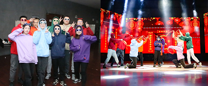
During the New Year’s party of our college, all the members of LYM lab put on an exceptional dance performance. The performance was full of energy and excitement, and it was evident that each member had put in a lot of effort and time to make it happen. Our performance was a great source of amusement for many students and teachers alike, and it brought New Year’s greetings to everyone. The reason our performance was fantastic was because of the amount of practice and hard work that each member had put in. We spent countless hours in the lab, rehearsing and perfecting every move to make sure that our performance was flawless. Our hard work paid off as our performance was seamless, and we were able to bring joy and happiness to everyone watching. The performance brought all of us lab members closer together and made us more familiar with each other. It was an incredible experience to work together and achieve something as a team. The joy and sense of accomplishment that we felt after our performance was indescribable.

Congratulations!


Year-end Gathering

Tongyue Sun
05 January 2024

As time has unfolded, we have journeyed through a fulfilling and challenging year together in 2023. Let us now come together to share the harvests and joys of this past year and collectively gaze into the boundless possibilities that lie ahead.

Gathering!


Prof. Yumei Li's paper was accepted by Genome Medicine

Junpeng Zhou
22 December 2023

Our professor’s paper titled “Multimodal Epigenetic Sequencing Analysis (MESA) of Cell-Free DNA for Non-Invasive Colorectal Cancer Detection” was accepted by Genome Medicine. The paper was recognized for its contributions to the field of non-invasive cancer detection.


A Delightful Lunch with Prof. Jingyi Jessica Li

Zhaoying Liu
06 December 2023

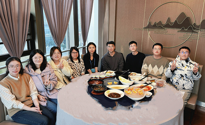
Today was a truly special day at our lab! Prof. Jingyi Jessica Li joined us for lunch, and we sampled the delicious flavors of Suzhou cuisine. We chatted, laughed, and shared stories and updates about our research. Professor Li’s warm personality and engaging stories made the lunch even more enjoyable. After lunch, we invited Prof. Li to visit our lab, and briefly introduced our work environment.

Thank you, Prof. Li, for taking the time to visit us and share your wisdom. Your visit was truly a highlight of our lab’s journey, and we are all grateful for the opportunity to learn from you!
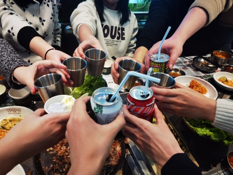
Congratulations!