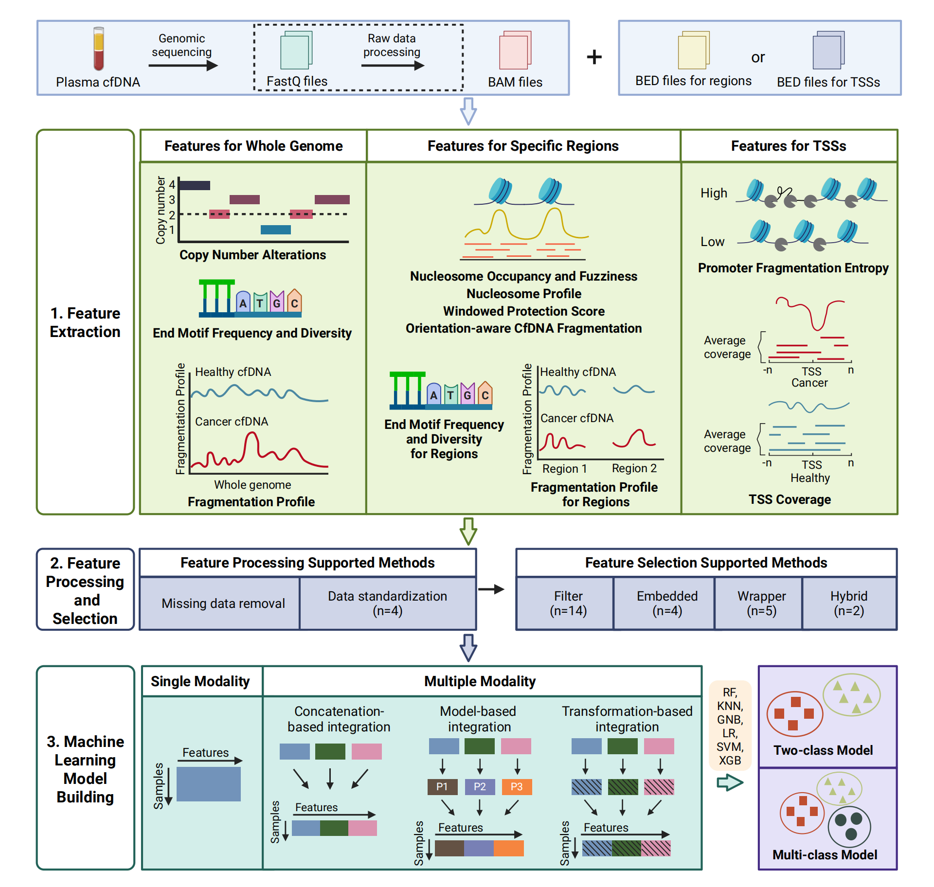
Table of Contents
- Section 1: Introduction
- Section 2: Visualization for the extracted features
- Section 2.1: Visualize genomic copy number differences
- Section 2.2: Visualize the genomic fragment size difference
- Section 2.3: Find genomic motif differences
- Section 2.4: Compare feature similarities and find redundant information
- Section 2.5: Find the differences of PFE for genes differentially expressed between different conditions
- Section 2.6: Visualize differences in nucleosome organization
- Section 3: Optimizing feature selection for machine learning models
- Section 4: Performance of different features in cancer detection and classification
- Section 5: Compare the performance metrics of single-modality and multi-modality models
- Section 6: Independent Validation Batch effect analysis
Section 1: Introduction
Liquid biopsy, powered by the analysis of plasma cell-free DNA (cfDNA), is revolutionizing diagnostic medicine by providing a non-invasive window into the genomic and epigenomic landscapes of human diseases, particularly cancers. cfDNA, which enters the bloodstream through cellular turnover across various tissues, offers an unprecedented opportunity for early detection, monitoring, and personalized treatment of diseases. Despite its promise, the field lacks a unified and comprehensive toolkit tailored for the systematic analysis of cfDNA sequencing data. cfDNAanalyzer addresses this critical gap by offering an integrated, user-friendly platform for feature extraction, filtering, selection, and machine learning model development for disease detection and classification. This toolkit empowers researchers and clinicians with the ability to perform customizable analyses, evaluate the performance of predictive models, and extract valuable insights from cfDNA-derived data. By facilitating precise, scalable, and reproducible cfDNA analysis, cfDNAanalyzer is poised to accelerate advancements in disease detection, monitoring, and research.
Section 2: Visualization for the extracted features
cfDNAanalyzer can extract a variety of features. In this section, users can visualize these features to better explore the full landscape of cfDNA characteristics.
Files in the directory output_directory/Features/ used in this section can be generated by cfDNAanalyzer with the following command :
bash cfDNAanalyzer.sh -I ./example/bam_input.txt \
                      -o output_directory \
                      -F CNA,EM,FP,NOF,NP,WPS,OCF,EMR,FPR,PFE \
                      --noDA
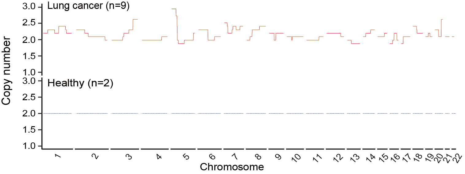
Section 2.1: Visualize genomic copy number differences
In this section, users can visualize genomic copy number differences between cancer and healthy samples using the CNA feature in output_directory/Features/CNA.csv.
File output_directory/Features/CNA.csv consists of rows representing different samples. The sample column holds the sample’s file name, followed by a label column that indicates the sample’s classification. For example, label “1” represents the cancer samples, while label “0” represents the healthy samples.
To begin, load the data from output directory and transform it.
library(ggplot2)
library(tidyr)

raw_data = read.csv("output_directory/Features/CNA.csv")
raw_data <- as.data.frame(t(raw_data))
colnames(raw_data) <- raw_data[1, ]
raw_data <- raw_data[-1, ]

# divide the cancer and healthy samples according to rowname `label`.
label_row <- unlist(raw_data["label", ])

cancer_cols <- which(label_row == 1)
df_cancer <- raw_data[rownames(raw_data) != "label", cancer_cols, drop = FALSE]

healthy_cols <- which(label_row == 0)
df_healthy <- raw_data[rownames(raw_data) != "label", healthy_cols, drop = FALSE]
Next, extract the mean value in cancer and healthy group and find the different regions.
df_cancer <- type.convert(df_cancer, as.is = FALSE)
df_cancer$average <- rowMeans(df_cancer,na.rm = TRUE)

df_healthy <- type.convert(df_healthy, as.is = FALSE)
df_healthy$average <- rowMeans(df_healthy,na.rm = TRUE)


# create `chr`, `start`, `end`column from rownames.
df_cancer$region <- rownames(df_cancer)
rownames(df_cancer) <- NULL
df_cancer <- separate(df_cancer, region, into = c("chr", "start", "end"), sep = "_")
df_cancer$chr <- sub("^.", "", df_cancer$chr)
df_cancer = df_cancer[,c("chr","start","end","average")]

df_healthy$region <- rownames(df_healthy)
rownames(df_healthy) <- NULL
df_healthy <- separate(df_healthy, region, into = c("chr", "start", "end"), sep = "_")
df_healthy$chr <- sub("^.", "", df_healthy$chr)
df_healthy = df_healthy[,c("chr","start","end","average")]


# eliminate the X chromosome and convert the data in the start and end columns to numeric values while sorting the entire data frame.
df_healthy <- df_healthy[df_healthy$chr != "X", ]
df_healthy$chr <- as.numeric(df_healthy$chr)
df_healthy$start <- as.numeric(df_healthy$start)
df_healthy <- df_healthy[order(df_healthy$chr, df_healthy$start), ]

df_cancer <- df_cancer[df_cancer$chr != "X", ]
df_cancer$chr <- as.numeric(df_cancer$chr)
df_cancer$start <- as.numeric(df_cancer$start)
df_cancer <- df_cancer[order(df_cancer$chr, df_cancer$start), ]


# add specific symbol columns to the data frame.
df_healthy$combine <- 1:nrow(df_healthy)
df_healthy$sample <- "Healthy"
df_healthy$condition <- "Healthy"
df_healthy$color <- "blue"

df_cancer$combine <- 1:nrow(df_cancer)
df_cancer$sample <- "Cancer"
df_cancer$condition <- "Cancer"
df_cancer$color <- "red"


# merge the healthy and cancer data frames together and sorting the combined data.
df_all = merge(df_cancer,df_healthy,by = c("chr", "start", "end"))
df_all <- df_all[order(df_all$chr, df_all$start), ]


# identify the regions that exhibit significant differences between the healthy and cancer samples, altering the color of these regions accordingly.
df_all$diff <- df_all$average.x / df_all$average.y
df_all$color <- ifelse(df_all$diff >= 1.5 | df_all$diff <= 2 / 3 , "green", "blue")
healthy_color = df_all$color
cancer_color <- ifelse(healthy_color == "blue", "red", healthy_color)
color = c(cancer_color,healthy_color)
Finally, visualize the results.
# bind the healthy and cancer data frames, setting the condition column as factor.
df = rbind(df_cancer, df_healthy)
df$condition <- factor(df$condition, levels = c("Cancer", "Healthy"))
df$color = color

my_theme <- theme_classic()+theme(axis.text.y = element_text(color = "black", size = 10),
                                  axis.text.x = element_blank(),
                                  axis.ticks.x = element_blank(),
                                  axis.title.x = element_blank(),
                                  strip.background = element_blank(),
                                  strip.placement = "outside")

# A dashed gray line is added at the CNA value of 2 to enhance the visualization
g <- ggplot(df, aes(x = combine, y = average, group = sample, color = color)) +
  geom_line(linewidth = 0.5) +
  facet_grid(cols = vars(chr), rows = vars(condition), switch = "x", space = "free_x", scales = "free") +
  coord_cartesian(xlim = NULL, ylim = c(1, 3), expand = TRUE) +
  labs(y = "Copy Number") +
  my_theme +
  geom_hline(yintercept = 2, linetype = "dashed", linewidth = 0.3, color = "gray") +
  scale_color_identity()
Users can get the following figure that shows genomic copy number differences between cancer and healthy samples.
Section 2.2: Visualize the genomic fragment size difference
In this section, users can visualize genomic fragment size differences between cancer and healthy samples using the FP feature in output_directory/Features/FP_fragmentation_profile.csv.
File output_directory/Features/FP_fragmentation_profile.csv consists of rows representing different samples. The sample column holds the sample’s file name, followed by a label column that indicates the sample’s classification. For example, label “1” represents the cancer samples, while label “0” represents the healthy samples.
First, load the data from output directory and transform it.
library(tidyr)
library(tidyverse)
library(multidplyr)
library(GenomicRanges)
library(readxl)
library(ggbreak)
library(reshape2)

raw_data = read.csv("output_directory/Features/filtered_FP_fragmentation_profile.csv")
raw_data <- as.data.frame(t(raw_data))
colnames(raw_data) <- raw_data[1, ]
raw_data <- raw_data[c(-1,-2), ]

# create `chr`, `start`, `end` column from rownames.
raw_data$region <- rownames(raw_data)
rownames(raw_data) <- NULL
raw_data <- separate(raw_data, region, into = c("chr", "start", "end"), sep = "_")
raw_data$chr <- gsub("chr", "", raw_data$chr)

data <- na.omit(raw_data)
data$arm = data$chr
data <- data[order(data$chr, data$start), ]
Then, change the file distributed in 100-kb intervals into 5Mb.
# assign the same combine value to every 50 regions for each chromosome.
data <- data %>%
  group_by(chr) %>%
  mutate(combine = ceiling((1:length(chr)) / 50))
data <- as.data.frame(data)
data$value = as.numeric(data$value)

# transform the data frame into long format.
data <- melt(data, id.vars=c("chr", "start", "end", "arm", "combine"),
             measure.vars=colnames(data)[-c(1, 2, 3, (ncol(data)-1), ncol(data))], variable.name = "sample")

# group and summarize the data by sample, chr, arm, and combine columns, retaining rows with a binsize of 50.
rst <- data %>%
  group_by(sample, chr, arm, combine) %>%
  summarize(start = dplyr::first(start),
            end = dplyr::last(end),
            binsize = n(),
            meanRatio = mean(value, na.rm = TRUE),
            varRatio = var(value, na.rm = TRUE))
rst <- rst %>% filter(binsize == 50)

# extract the mean ratio for each sample and the centered ratio for the 5 Mb regions.
meanValue = aggregate(meanRatio ~ sample, rst, FUN = mean)
meanValue <- as.data.frame(apply(meanValue, 2, FUN = rep, each = nrow(rst) / 11), stringsAsFactors = FALSE)  ## Number 11 is total number of healthy and cancer samples
meanValue$sample = as.factor(meanValue$sample)
meanValue$meanRatio = as.numeric(meanValue$meanRatio)
rst$centeredRatio <- rst$meanRatio - meanValue$meanRatio
Finally, visualize the results.
# establish the condition and color columns
rst$condition <- c(rep("Healthy", 1042),rep("Cancer", 4689))
rst$color <- c(rep("blue", 1042),rep("red", 4689)) ## The numbers 1042 and 4689 are the number of 5Mb regions of healthy and cancer samples in rst, respectively
rst$condition <- factor(rst$condition, levels = c("Healthy", "Cancer"))

my_theme <- theme_classic() +
  theme(axis.text.y = element_text(color = "black", size = 10),
        axis.text.x = element_blank(),
        axis.ticks.x = element_blank(),
        axis.title.x = element_blank(),
        strip.background = element_blank(),
        strip.placement = "outside")

g <- ggplot(rst, aes(x=combine, y=centeredRatio, group=sample, color=color)) +
  geom_line(linewidth=0.2) +
  facet_grid(cols = vars(arm), rows = vars(condition), switch = "x", space = "free_x", scales = "free") +
  coord_cartesian(ylim=c(-0.4, 0.5), expand = TRUE) +
  labs(y="Fragmentation profile") +
  scale_color_identity() +
  my_theme
Users can get the following figure that shows genomic fragment size differences between cancer and healthy samples.
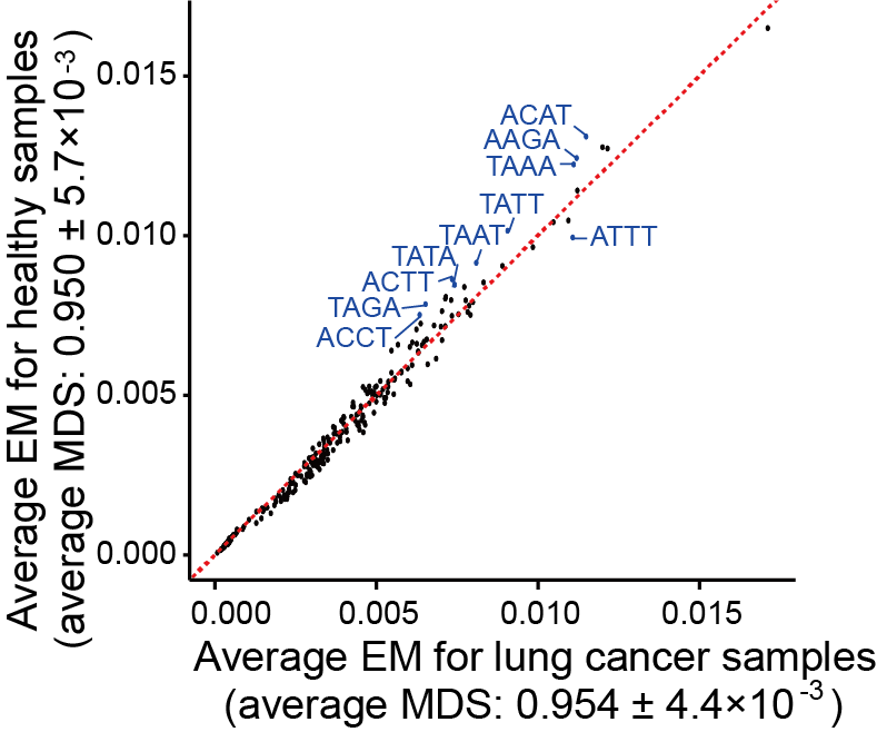
Section 2.3: Find genomic motif differences
In this section, users can find the top motifs with the most significant differences between cancer and healthy samples using the EM feature in output_directory/Features/EM_motifs_frequency.csv and output_directory/Features/EM_motifs_mds.csv.
File output_directory/Features/EM_motifs_frequency.csv and output_directory/Features/EM_motifs_mds.csv consist of rows representing different samples. The sample column holds the sample’s file name, followed by a label column that indicates the sample’s classification. For example, label “1” represents the cancer samples, while label “0” represents the healthy samples.
First , load the data and transform it.
library(tidyr)
library(ggplot2)

raw_data = read.csv("output_directory/Features/EM_motifs_frequency.csv")
raw_data <- as.data.frame(t(raw_data))
colnames(raw_data) <- raw_data[1, ]
raw_data <- raw_data[-1, ]

# divide the cancer and healthy samples according to rowname `label`.
label_row <- unlist(raw_data["label", ])

cancer_cols <- which(label_row == 1)
df_cancer <- raw_data[rownames(raw_data) != "label", cancer_cols, drop = FALSE]

healthy_cols <- which(label_row == 0)
df_healthy <- raw_data[rownames(raw_data) != "label", healthy_cols, drop = FALSE]
Next, extract the mean value in cancer and healthy group.
df_cancer <- type.convert(df_cancer, as.is = FALSE)
df_cancer$average_cancer <- rowMeans(df_cancer,na.rm = TRUE)

df_healthy <- type.convert(df_healthy, as.is = FALSE)
df_healthy$average_healthy <- rowMeans(df_healthy,na.rm = TRUE)

# we create `motif` column from rownames and extract average value.
df_cancer$motif <- rownames(df_cancer)
rownames(df_cancer) <- NULL
df_cancer = df_cancer[,c("motif","average_cancer")]

df_healthy$motif <- rownames(df_healthy)
rownames(df_healthy) <- NULL
df_healthy = df_healthy[,c("motif","average_healthy")]
Then, get the mean value and standard deviation of end motif diversity score of every group.
raw_data_mds = read.csv("output_directory/Features/EM_motifs_mds.csv")
cancer_mds = raw_data_mds[raw_data_mds$label == 1, ]
healthy_mds = raw_data_mds[raw_data_mds$label == 0, ]

mean_cancer = mean(cancer_mds$MDS)
sd_cancer = sd(cancer_mds$MDS)

mean_healthy = mean(healthy_mds$MDS)
sd_healthy = sd(healthy_mds$MDS)
Finally, visualize the results.
# merge the data from both healthy and cancer samples and rank the motifs based on their frequency
FREQ = merge(df_cancer, df_healthy, by = c("motif"))
FREQ$diff <- abs(FREQ$average_healthy - FREQ$average_cancer)
FREQ$rank <- rank(-FREQ$diff)

# identify the indices of the top 10 motifs in terms of frequency and change their colors accordingly.
top_rank_indices <- order(FREQ$rank)[1:10]
FREQ$color <- ifelse(1:nrow(FREQ) %in% top_rank_indices, "blue", "black")

g <- ggplot(FREQ, aes(x = average_cancer, y = average_healthy)) +
  geom_point(aes(color = color)) +
  labs(x = "Average EM for cancer samples (average MDS: 0.954 ± 0.0044)",
  ## Number 0.954 and 0.00044 are the mean value and standard deviation of cancer samples
       y = "Average EM for healthy samples (average MDS: 0.950 ± 0.0057)") +
  ## Number 0.950 and 0.00057 are the mean value and standard deviation of healthy samples
  theme_minimal() +
  geom_abline(slope = 1, intercept = 0, color = "red", linetype = "dashed") +
  scale_color_identity() +
  theme(panel.grid.major = element_blank(),
        panel.grid.minor = element_blank(),
        axis.line = element_line(colour = "black"),
        axis.ticks = element_line(colour = "black"),
        axis.ticks.length = unit(0.25, "cm"))
Users can get the following figure that shows top motifs with the most significant differences between cancer and healthy samples.
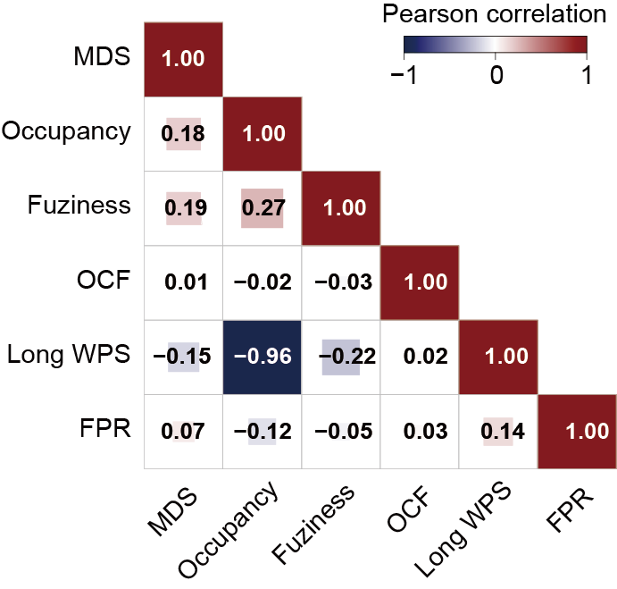
Section 2.4: Compare feature similarities and find redundant information
In this section, users can compare feature similarities and choose features with no redundant information using features in output_directory/Features/NOF_meanfuziness.csv , output_directory/Features/NOF_occupancy.csv , output_directory/Features/WPS_long.csv , output_directory/Features/OCF.csv , output_directory/Features/EMR_region_mds.csv , output_directory/Features/FPR_fragmentation_profile_regions.csv.
Files output_directory/Features/NOF_meanfuziness.csv , output_directory/Features/NOF_occupancy.csv , output_directory/Features/WPS_long.csv , output_directory/Features/OCF.csv , output_directory/Features/EMR_region_mds.csv , output_directory/Features/FPR_fragmentation_profile_regions.csv consist of rows representing different samples. The sample column holds the sample’s file name, followed by a label column that indicates the sample’s classification. For example, label “1” represents the cancer samples, while label “0” represents the healthy samples.
First, load all the data and transform them (Take NO as example).
library(tidyr)
library(corrplot)

NO_data = read.csv("output_directory/Features/NOF_occupancy.csv")
NO_data <- as.data.frame(t(NO_data))
colnames(NO_data) <- NO_data[1, ]
NO_data <- NO_data[c(-1,-2), ]
NO_data$region <- rownames(NO_data)
rownames(NO_data) <- NULL
NO_data <- separate(NO_data, region, into = c("chr", "start", "end"), sep = "_")
Next, merge the features into an input BED file and extract the correlation values between each feature.
# put the basename (filename deleting ".bam") of every sample into a vector.
basename = c("basename1","basename2",...,"basenameN")

for (i in basename) {
    # region is the input BED file
    region <- read.table("/input.bed", header = F, sep = "\t" )
    names(region) <- c("chr", "start","end")

    NO = NO_data[, c("chr", "start", "end", i)]
    colnames(NO) <- c("chr", "start", "end", "NO")
    region <- merge(region, NO, all.x = TRUE)

    NF = NF_data[, c("chr", "start", "end", i)]
    colnames(NF) <- c("chr", "start", "end", "NF")
    region <- merge(region, NF, all.x = TRUE)

    WPS_long = WPS_long_data[, c("chr", "start", "end", i)]
    colnames(WPS_long) <- c("chr", "start", "end", "WPS_long")
    region <- merge(region, WPS_long, all.x = TRUE)

    OCF = OCF_data[, c("chr", "start", "end", i)]
    colnames(OCF) <- c("chr", "start", "end", "OCF")
    region <- merge(region, OCF, all.x = TRUE)

    EMR = EMR_data[, c("chr", "start", "end", i)]
    colnames(EMR) <- c("chr", "start", "end", "EMR")
    region <- merge(region, EMR, all.x = TRUE)

    FPR = FPR_data[, c("chr", "start", "end", i)]
    colnames(FPR) <- c("chr", "start", "end", "FPR")
    region <- merge(region, FPR, all.x = TRUE)

    region <- na.omit(region)
    region = region[,c(-1,-2,-3)]
    region <- type.convert(region, as.is = FALSE)
    assign(paste0("correlation_matrix_", i), cor(region))
}
Finally, visualize the results.
# get all the correlation matrices' names and check is there any matrix with NA.
matrix_names <- ls(pattern = "^correlation_matrix_")
valid_matrices <- list()
for (name in matrix_names) {
  matrix <- get(name)
  if (!any(is.na(matrix))) {
    valid_matrices[[name]] <- matrix
  }
}

# determine the dimensions of each correlation matrix and create an average matrix from them.
n_rows <- nrow(valid_matrices[[1]])
n_cols <- ncol(valid_matrices[[1]])
average_matrix <- matrix(0, n_rows, n_cols)
for (matrix in valid_matrices) {
  average_matrix <- average_matrix + matrix
}
average_matrix <- average_matrix / length(valid_matrices)

corrplot(average_matrix,
         method = "square",
         type = "lower",
         order = "hclust",
         addCoef.col = "black",
         tl.col = "black",
         tl.srt = 0,
         tl.cex = 0.8,
         number.cex = 1)
Users can get the following figure that compares feature similarities.
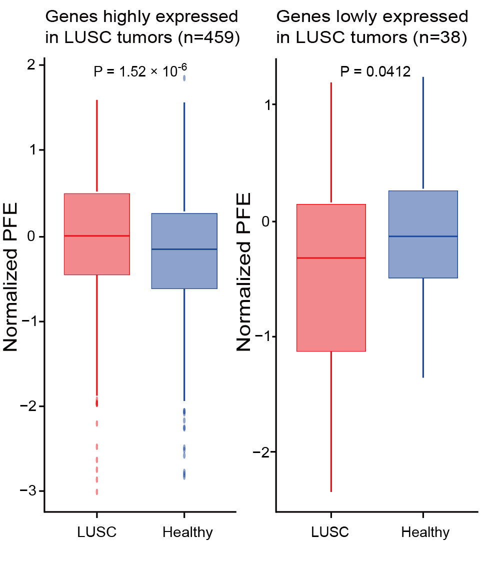
Section 2.5: Find the differences of PFE for genes differentially expressed between different conditions
In this section, users can find the differences of PFE for genes differentially expressed between different conditions using features in output_directory/Features/PFE.csv.
File output_directory/Features/PFE.csv consists of rows representing different samples. The sample column holds the sample’s file name, followed by a label column that indicates the sample’s classification. For example, label “1” represents the cancer samples, while label “0” represents the healthy samples.
First, load the genes. Then load data from output directory and transform it.
library(ggplot2)
library(dplyr)

control_genes_df = read.table("/cfDNAanalyzer/Epic-seq/code/priordata/control_hg19.txt",header = F)
control_genes = control_genes_df[,3]
under_genes <- read.table("/path/to/under_genes.txt", header = F, sep = "\t")
under_genes <- under_genes[[1]]
over_genes <- read.table("/path/to/over_genes.txt", header = F, sep = "\t")
over_genes <- over_genes[[1]]

raw_data = read.csv("output_directory/Features/PFE.csv")
raw_data <- as.data.frame(t(raw_data))
colnames(raw_data) <- raw_data[1, ]
raw_data <- raw_data[-1, ]

# divide the cancer and healthy samples according to rowname `label`.
label_row <- unlist(raw_data["label", ])

cancer_cols <- which(label_row == 1)
df_cancer <- raw_data[rownames(raw_data) != "label", cancer_cols, drop = FALSE]

healthy_cols <- which(label_row == 0)
df_healthy <- raw_data[rownames(raw_data) != "label", healthy_cols, drop = FALSE]
Then, extract PFE value in under-expressed and over-expressed genes.
# extract the mean PFE value in cancer and healthy group
df_cancer <- type.convert(df_cancer, as.is = FALSE)
df_cancer$average <- rowMeans(df_cancer,na.rm = TRUE)

df_healthy <- type.convert(df_healthy, as.is = FALSE)
df_healthy$average <- rowMeans(df_healthy,na.rm = TRUE)

df_cancer$TSS_ID <- rownames(df_cancer)
rownames(df_cancer) <- NULL
df_cancer = df_cancer[,c("TSS_ID","average")]

df_healthy$TSS_ID <- rownames(df_healthy)
rownames(df_healthy) <- NULL
df_healthy = df_healthy[,c("TSS_ID","average")]

# extract the normalized PFE after removing control genes
pattern <- paste(control_genes, collapse = "|")
regex <- paste0("^((", pattern, ")|(", pattern, ")_[0-9]+)$")
rows_to_remove <- grep(regex, df_cancer[[1]])

df_cancer <- df_cancer[-rows_to_remove, ]
df_cancer$normalized_PFE = scale(df_cancer$average)
normalized_df_cancer = df_cancer[,c("TSS_ID","normalized_PFE")]

df_healthy <- df_healthy[-rows_to_remove, ]
df_healthy$normalized_PFE = scale(df_healthy$average)
normalized_df_healthy = df_healthy[,c("TSS_ID","normalized_PFE")]

# extract PFE of under-expressed and over-expressed genes in cancer and healthy samples.
pattern_1 <- paste(under_genes, collapse = "|")
regex <- paste0("^((", pattern_1, ")|(", pattern_1, ")_[0-9]+)$")
rows_to_keep <- grep(regex, normalized_df_cancer[[1]])
cancer_under <- normalized_df_cancer[rows_to_keep, ]
average_cancer_under = cancer_under$normalized_PFE

pattern_1 <- paste(over_genes, collapse = "|")
regex <- paste0("^((", pattern_1, ")|(", pattern_1, ")_[0-9]+)$")
rows_to_keep <- grep(regex, normalized_df_cancer[[1]])
cancer_over <- normalized_df_cancer[rows_to_keep, ]
average_cancer_over = cancer_over$normalized_PFE


pattern_1 <- paste(under_genes, collapse = "|")
regex <- paste0("^((", pattern_1, ")|(", pattern_1, ")_[0-9]+)$")
rows_to_keep <- grep(regex, normalized_df_healthy[[1]])
healthy_under <- normalized_df_healthy[rows_to_keep, ]
average_healthy_under = healthy_under$normalized_PFE

pattern_1 <- paste(over_genes, collapse = "|")
regex <- paste0("^((", pattern_1, ")|(", pattern_1, ")_[0-9]+)$")
rows_to_keep <- grep(regex, normalized_df_healthy[[1]])
healthy_over <- normalized_df_healthy[rows_to_keep, ]
average_healthy_over = healthy_over$normalized_PFE
Finally, visualize the results.
# create a data frame in long format that combines the PFE of the under-expressed genes
df_under <- data.frame(
  value = c(average_cancer_under, average_healthy_under),
  group = factor(c(rep("Cancer", length(average_cancer_under)), rep("Healthy", length(average_healthy_under))))
)
df_under$group <- factor(df_under$group, levels = c("Cancer", "Healthy"))

df_over <- data.frame(
  value = c(average_cancer_over, average_healthy_over),
  group = factor(c(rep("Cancer", length(average_cancer_over)), rep("Healthy", length(average_healthy_over))))
)
df_over$group <- factor(df_over$group, levels = c("Cancer", "Healthy"))

# perform a Wilcoxon test to compare the healthy and cancer samples and obtain the p-value.
wilcox_test_result_under <- wilcox.test(value ~ group, data = df_under)
p_value_under <- wilcox_test_result_under$p.value

wilcox_test_result_over <- wilcox.test(value ~ group, data = df_over)
p_value_over <- wilcox_test_result_over$p.value


g = ggplot(df_under, aes(x = group, y = value)) +
  geom_boxplot() +
  labs(title = "Boxplot of Cancer PFE vs Healthy PFE in under-expressed genes", x = "Group", y = "PFE Values") +
  theme_minimal()+
  geom_text(
    x = 1.5,
    y = max(df_under$value) * 0.9,
    label = paste("p-value:", round(p_value_under, 4)),
    size = 5
  )


p = ggplot(df_over, aes(x = group, y = value)) +
  geom_boxplot() +
  labs(title = "Boxplot of Cancer PFE vs Healthy PFE in over-expressed genes", x = "Group", y = "PFE Values") +
  theme_minimal() +
  geom_text(
    x = 1.5,
    y = max(df_over$value) * 0.9,
    label =  paste("p-value:", round(p_value_over, 4)),
    size = 5
  )
Users can get the following figure that shows the differences of PFE for genes differentially expressed between different conditions.
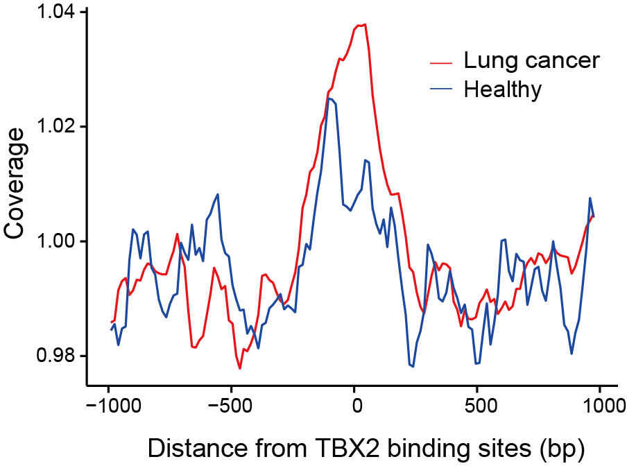
Section 2.6: Visualize differences in nucleosome organization
In this section, users can visualize differences in nucleosome organization around TF in cancer and healthy samples using feature NP in the directory output_directory/Features/NP_site_list/. (Take file output_directory/Features/NP_site_list/site_list1.txt as an example)
Files in the directory output_directory/Features/NP_site_list/ consist of rows representing different samples. The sample column holds the sample’s file name, followed by a label column that indicates the sample’s classification. For example, label “1” represents the cancer samples, while label “0” represents the healthy samples.
First, load data from output directory.
library(ggplot2)
library(reshape2)

raw_data = read.csv("/Features/NP_site_list/site_list1.txt")

df_cancer <- raw_data[raw_data$label == 1, ]
df_healthy <- raw_data[raw_data$label == 0, ]
Next, extract the mean value in cancer and healthy group.
df_cancer <- df_cancer[,c(3,134)]
mean_cancer = rowMeans(df_cancer)

df_healthy <- df_healthy[,c(3,134)]
mean_healthy = rowMeans(df_healthy)

sample <- read.csv("/Features/NP_site_list/site_list1.txt", header = F)
site_number = sample[1,c(3:134)]
site_number <- as.vector(t(site_number))
Finally, visualize the results.
# put the coverage data of healthy and cancer samples into a data frame and transform it into long data frame form.
df = data.frame(
  Column1  = site_number,
  Cancer = mean_cancer,
  Healthy = mean_healthy
)

df_long <- melt(df, id.vars = "Column1", variable.name = "Group", value.name = "Value")

g <- ggplot(data = df_long, aes(x = Column1, y = Value, color = Group)) +
  geom_line() +
  labs(x = "Distance from site",
        y = "Coverage") +
  scale_color_manual(values = c("Cancer" = "red", "Healthy" = "blue")) +
  theme_minimal() +
  theme(panel.grid.major = element_blank(),
        panel.grid.minor = element_blank(),
        axis.line = element_line(colour = "black"),
        axis.ticks = element_line(colour = "black"),
        axis.ticks.length = unit(0.25, "cm"))
Users can get the following figure that shows differences in nucleosome organization in cancer and healthy samples.
Section 3: Optimizing feature selection for machine learning models
Users can make an initial evaluation by leveraging cfDNAanalyzer’s powerful feature extraction module, which is essential for the analysis of genomic and fragmentomic features from cfDNA sequencing data. After an initial exploration of the features, cfDNAanalyzer was used to identify the most discriminative features using four main classes of feature selection methods: filters, embedded, wrappers, and hybrid methods (25 methods in total supported).
Files in the directory output_directory/Feature_Processing_and_Selection/Feature_Selection used in this section can be generated by cfDNAanalyzer with the following command :
bash cfDNAanalyzer.sh -I ./example/bam_input.txt \
                      -o output_directory \
                      -F CNA,EM,FP,NOF,NP,WPS,OCF,EMR,FPR,PFE \
                      --noML \
                      --filterMethod 'IG CHI' \
                      --filterNum 0.2 \
                      --wrapperMethod 'BOR' \
                      --wrapperNum 0.2 \
                      --embeddedMethod 'LASSO RIDGE' \
                      --embeddedNum 0.2 \
                      --hybridType FE \
                      --hybridMethod1 'CHI' \
                      --hybridMethod2 'LASSO' \
                      --hybridNum1 0.2 \
                      --hybridNum2 0.2
Section 3.1: Methods of feature selection
The feature selection methods in cfDNAanalyzer include four categories: embedded, filter, wrapper, and hybrid, implemented across four major parameters: --filterMethod, --wrapperMethod, --embeddedMethod, --hybridType. Users can select the appropriate parameters and run the cfDNAanalyzer based on their preferred method.
bash cfDNAanalyzer.sh \
-I ./example/bam_input.txt \
-F CNA \
--noML \
--filterMethod 'IG CHI' \
--filterNum 0.2 \
--wrapperMethod 'BOR' \
--wrapperNum 0.2 \
--embeddedMethod 'LASSO RIDGE' \
--embeddedNum 0.2 \
--hybridType FE \
--hybridMethod1 'CHI' \
--hybridMethod2 'LASSO' \
--hybridNum1 0.2 \
--hybridNum2 0.2
Parameters:
--noML: Skip machine learning model building, only feature processing and selection will be conducted. \
--filterMethod: Filter methods employed for feature selection (IG CHI FS FCBF PI CC LVF MAD DR MI RLF SURF MSURF TRF). \
--filterNum: Number of features to retain when employing the filter method. \
--wrapperMethod: Wrapper methods employed for feature selection (FFS BFS EFS RFS BOR). \
--wrapperNum: Number of features to retain when employing the wrapper method. \
--embeddedMethod: Embedded methods employed for feature selection (LASSO RIDGE ELASTICNET RF). \
--embeddedNum: Number of features to retain when employing the embedded method. \
--hybridType: Two methods used for hybrid method (FW/FE). \
--hybridMethod1,hybridMethod2: Subtype methods designated for method 1 and method 2 in the "--hybridType". \
--hybridNum1,hybridNum2: Number of features to retain for method 1 and method 2 in the "--hybridType".
Section 3.2: Visualize feature selection effect
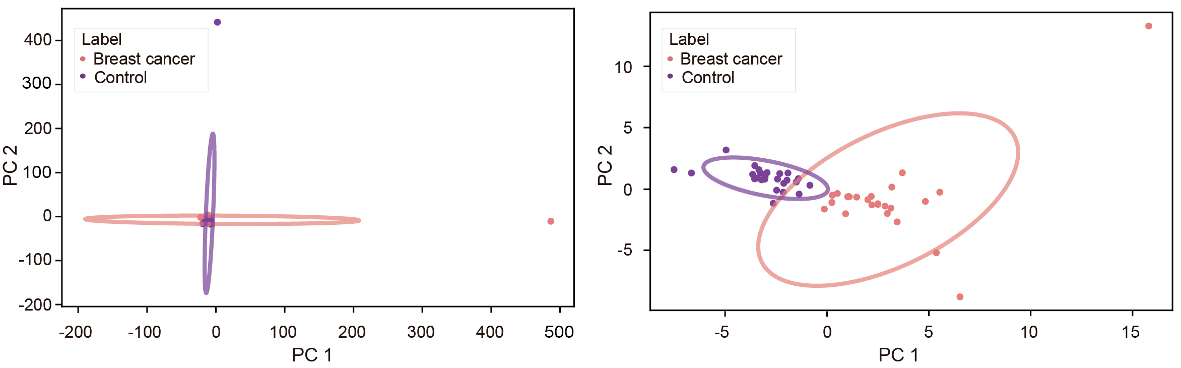
In this section, users can perform binary and multi-class PCA analysis on the optimized features. The breast cancer genome-wide dataset was used as an example to compare the results of PCA before and after the application of feature selection.
First, load the filtered features and process the data. Files in the directory output_directory/Feature_Processing_and_Selection/Feature_Selection will be used.
Files in the directory output_directory/Feature_Processing_and_Selection/Feature_Selection consist of rows representing different samples. The sample column holds the sample’s file name, followed by a label column that indicates the sample’s classification. For example, label “1” represents the cancer samples, while label “0” represents the healthy samples.
import os
import pandas as pd
import numpy as np
import matplotlib.pyplot as plt
import matplotlib
# Ensure matplotlib uses non-interactive Agg backend
matplotlib.use('Agg')
os.environ["DISPLAY"] = ":0"  # Disable X server related environment variables
from sklearn.decomposition import PCA
from sklearn.preprocessing import StandardScaler
import argparse
from matplotlib.patches import Ellipse

file = "output_directory/Feature_Processing_and_Selection/Feature_Selection/[FeatureName]_[Method]_selectd.csv"
df = pd.read_csv(file)

# Identify the sample column
sample_col = None
for col in df.columns:
    if col.lower() == 'sample':
        sample_col = col
        break
if sample_col is None:
    raise ValueError(f"No sample column found in file {file}. Expected a column named 'sample' (case-insensitive).")

# Drop label columns
if 'label' not in df.columns:
    raise ValueError(f"No 'label' column found in file {file}.")
X = df.drop(columns=[sample_col, 'label'])

# Standardize the data
X_scaled = StandardScaler().fit_transform(X)
Next, perform PCA analysis.
pca = PCA()
X_pca = pca.fit_transform(X_scaled)

# Create a DataFrame for PCA results
pca_columns = [f'PC{i+1}' for i in range(X_pca.shape[1])]
pca_df = pd.DataFrame(data=X_pca, columns=pca_columns)
pca_df[sample_col] = df[sample_col]
pca_df['label'] = df['label']

# Calculate explained variance and cumulative variance
explained_variance = pca.explained_variance_ratio_cumulative_variance = np.cumsum(explained_variance)
Finally, visualize the results.
#Plot cumulative variance
last_pc_index = next((i for i, v in enumerate(cumulative_variance) if v > 0.9), len(cumulative_variance))
plt.bar(range(1, last_pc_index + 1), cumulative_variance[:last_pc_index], color='lightblue')
plt.xlabel('Number of PCs')
plt.ylabel('Cumulative Variance Explained')
plt.xticks(range(1, last_pc_index + 1))
plt.ylim(0, 0.9)
plt.grid(axis='y', alpha=0.3)
plt.tight_layout()
plt.close()

# Only plot PC1 vs PC2 if at least 2 PCs are available
if X_pca.shape[1] < 2:
    print("Only one principal component available. Skipping PC1 vs PC2 plot.")
else:
    print("Plotting PC1 vs PC2...")
    plt.figure(figsize=(10, 6))
    colors = ['lightcoral', 'darkorchid']
    labels = df['label'].unique()
    for label, color in zip(labels, colors):
        pc1 = pca_df[df['label'] == label]['PC1']
        pc2 = pca_df[df['label'] == label]['PC2']
        plt.scatter(pc1, pc2, c=color, label=label, edgecolor=color)
        center_pc1 = pc1.mean()
        center_pc2 = pc2.mean()
        cov = np.cov(pc1, pc2)
        lambda_, v = np.linalg.eig(cov)
        angle = np.degrees(np.arctan2(v[1, 0], v[0, 0]))
        width = 2 * np.sqrt(lambda_[0]) * 2
        height = 2 * np.sqrt(lambda_[1]) * 2
        ellipse = Ellipse(
            (center_pc1, center_pc2),
            width=width,
            height=height,
            angle=angle,
            color=color,
            fill=False,
            linewidth=2,
            alpha=0.7
        )
        plt.gca().add_patch(ellipse)
    plt.xlabel('PC1')
    plt.ylabel('PC2')
    plt.legend(title='Label')
    plt.tight_layout()
    plt.close()
Users can get the following figure that visualizes the feature selection effect before (left) and after (right) optimization.
Section 4: Performance of different features in cancer detection and classification
In this part, user can test the performance of different features in single-modality models and visualize them. This facilitates informed decision-making when selecting modalities for the subsequent integration of multiple features.
Files in the directory output_directory/Machine_Learning/single_modality used in this section can be generated by cfDNAanalyzer with the following command :
bash cfDNAanalyzer.sh -I ./example/bam_input.txt \
                      -o output_directory \
                      -F CNA,EM,FP,NOF,NP,WPS,OCF,EMR,FPR,PFE \
                      --classNum 2
                      --cvSingle KFold
                      --nsplitSingle 5
                      --classifierSingle 'KNN'
Section 4.1: Predictive effect of different features in cancer detection
In this section, user can evaluate the cancer prediction probability of different features and calculate the correlation.
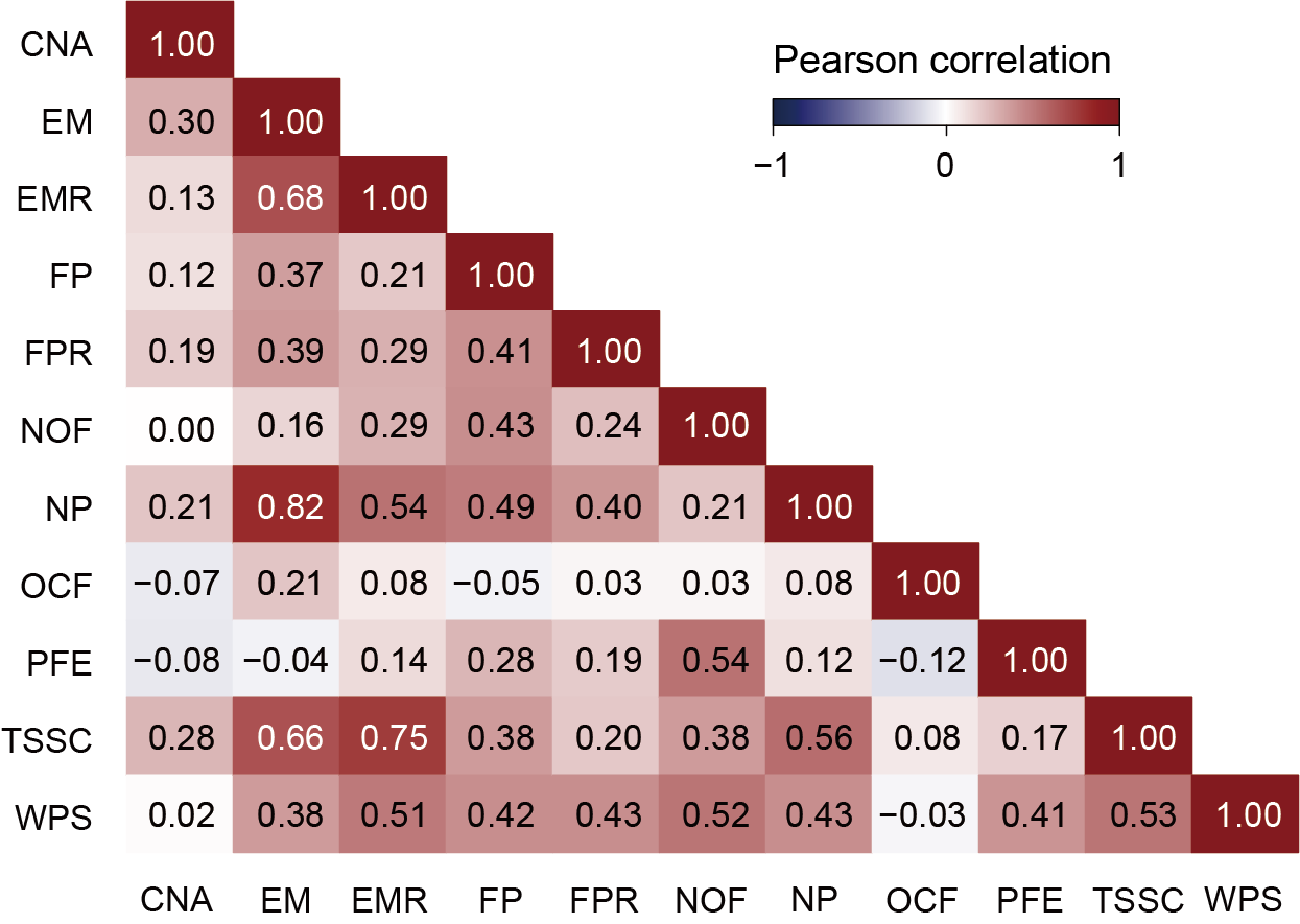
Firstly, user needs to extract the probability that each feature predicts the sample to be cancer through different classifiers in the cancer prediction results of the binary classification model, and then integrate the prediction results of all features. The user can also calculate and visualize the correlation of the probability of 11 features predicted to be cancer samples in different classifiers to obtain correlation plot. (Take CNA as an example, the result file of probability of predicting cancer for samples based on features is at output_directory/Machine_Learning/single_modality/CNA/single_modality_metrics.csv)
File output_directory/Machine_Learning/single_modality/CNA/single_modality_metrics.csv contains the classifier and feature selection method used, followed by various performance metrics such as accuracy, precision, recall, F1 score, AUC (Area Under the Curve), computation time and memory usage (peak memory).
all_probability = read.csv("output_directory/Machine_Learning/single_modality/CNA/single_modality_metrics.csv")
all_probability <- all_probability[
  all_probability$Classifier == "SVM" &
    all_probability$FS_Combination == "wrapper_BOR_0.023618328", ]
all_probability = all_probability[,c("SampleID"),drop = F]

# Take CNA as an example
CNA = read.csv(paste0("output_directory/Machine_Learning/single_modality/CNA/single_modality_metrics.csv"))
CNA <- CNA[CNA$Classifier == "XGB" & CNA$FS_Combination == "wrapper_BOR_0.023618328",]
CNA_probability = CNA[,c("SampleID","Prob_Class1")]
colnames(CNA_probability) <- c("SampleID", "CNA")
all_probability = merge(all_probability,CNA_probability,by = "SampleID")

all_probability = all_probability[order(all_probability$SampleID),]
all_probability = all_probability[,-1]
matrix = cor(all_probability)
library(corrplot)
col <- colorRampPalette(c("#00005A", "white", "#8B0000"))(200)
corrplot(matrix,
         method = "color",
         type = "lower",
         order = "original",
         addCoef.col = "black",
         tl.col = "black",
         tl.srt = 0,
         tl.cex = 0.8,
         number.cex = 1,
         col = col)
Users can get the following figure that shows the predictive effect of different features in cancer detection.
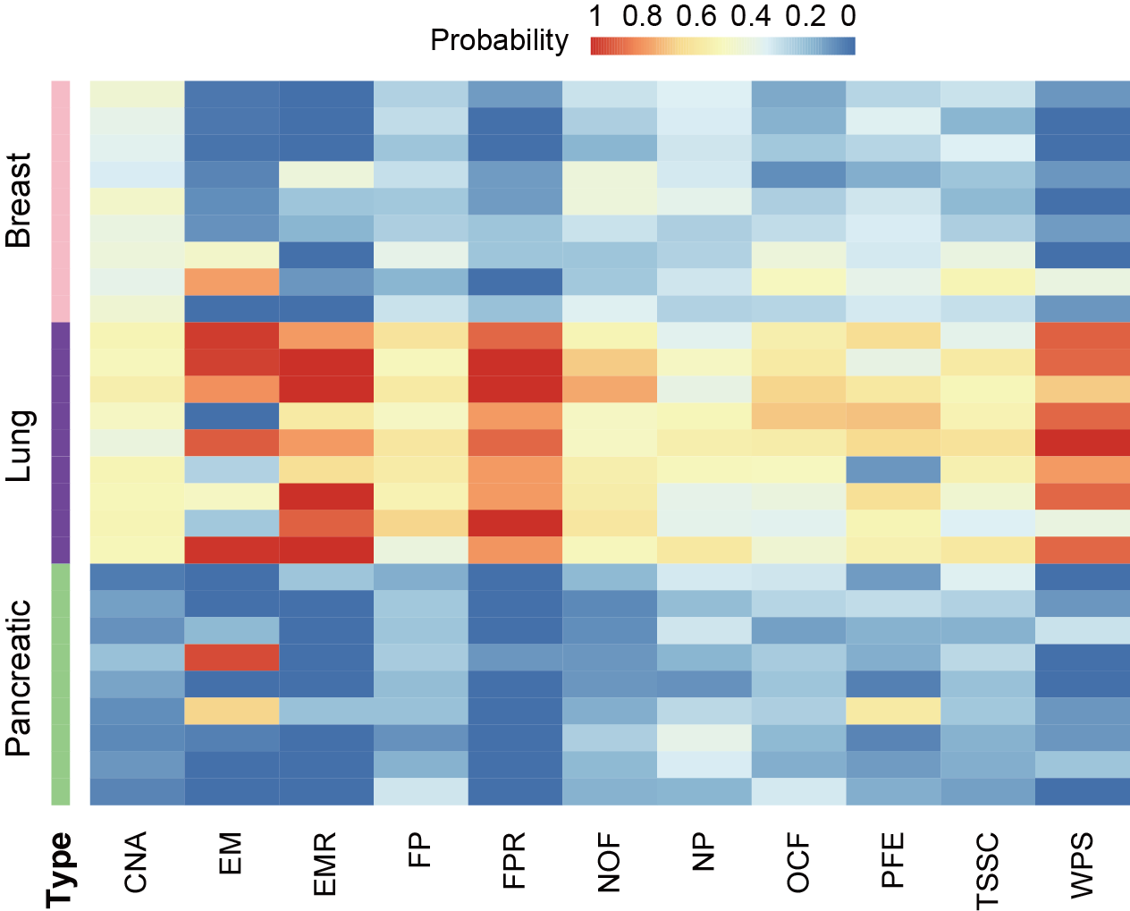
Section 4.2: Predictive effect of different features in cancer classification
In this section, user can evaluate the predicted probability of different features predicting the same sample as a certain cancer.
First, user needs to extract the probability that each feature predicts each sample to be each cancer in the cancer prediction result of the multi-classification model, and then integrate the prediction results of all features. “probability_0” represents breast cancer, “probability_1” represents lung cancer, and “probability_2” represents pancreatic cancer. In the following example, the data extraction and processing step takes the CNA feature as an example, and the result file of probability for samples based on features is at output_directory/Machine_Learning/single_modality/CNA/single_modality_metrics.csv. The visualization result is the probability heatmap of the lung cancer sample predicted into each cancer type.
File output_directory/Machine_Learning/single_modality/CNA/single_modality_metrics.csv contains samples IDs and their true labels, followed by the classifier, feature selection method used and predicted probabilities for each class.
all_probability = read.csv("output_directory/Machine_Learning/single_modality/CNA/single_modality_metrics.csv")
all_probability <- all_probability[
  all_probability$Classifier == "SVM" &
    all_probability$FS_Combination == "wrapper_BOR_0.023618328",
]
all_probability = all_probability[,c("SampleID"),drop = F]
all_probability_0 = all_probability_1 = all_probability_2 = all_probability

# Take CNA as an example
CNA = read.csv(paste0("output_directory/Machine_Learning/single_modality/CNA/single_modality_metrics.csv"))
CNA <- CNA[CNA$Classifier == "XGB" & CNA$FS_Combination == "wrapper_BOR_0.023618328",]

CNA_probability_0 = CNA[,c("SampleID","Prob_Class0")]
colnames(CNA_probability_0) <- c("SampleID", "CNA")
all_probability_0 = merge(all_probability_0,CNA_probability_0,by = "SampleID")

CNA_probability_1 = CNA[,c("SampleID","Prob_Class0")]
colnames(CNA_probability_1) <- c("SampleID", "CNA")
all_probability_1 = merge(all_probability_1,CNA_probability_1,by = "SampleID")

CNA_probability_2 = CNA[,c("SampleID","Prob_Class0")]
colnames(CNA_probability_2) <- c("SampleID", "CNA")
all_probability_2 = merge(all_probability_2,CNA_probability_2,by = "SampleID")


lung_probability_0 = all_probability_0[c(7:15),]
lung_probability_0$type = "probability_0"
lung_probability_1 = all_probability_1[c(7:15),]
lung_probability_1$type = "probability_1"
lung_probability_2 = all_probability_2[c(7:15),]
lung_probability_2$type = "probability_2"
lung_probability = rbind(lung_probability_0,lung_probability_1,lung_probability_2)

# Visualization
library(pheatmap)
annotation_df <- data.frame(type = lung_probability$type)
annotation_df$type <- factor(annotation_df$type)
type_colors <- c("probability_0" = "pink", "probability_1" = "purple","probability_2" = "lightgreen")
annotation_colors <- list(type = type_colors)
heatmap_data_lung <- lung_probability[,c(-1,-13)]
rownames(heatmap_data_lung) = rownames(annotation_df)
pheatmap(heatmap_data_lung,
         scale = "none",
         show_colnames = TRUE,
         cluster_cols = F,
         cluster_rows = F,
         show_rownames = F,
         treeheight_row = 0,
         treeheight_col = 0,
         annotation_row = annotation_df,
         annotation_colors = annotation_colors,
         border_color = NA)
Users can get the following figure that shows predictive effect of different features in cancer classification.

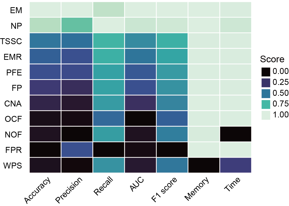
Section 4.3: Composite scoring system for single-modality models
In this section, user can use a composite scoring system that integrates both performance and usability metrics to evaluate model performance. Files output_directory/Machine_Learning/single_modality/[FeatureName]/single_modality_metrics.csv will be used.
Files output_directory/Machine_Learning/single_modality/[FeatureName]/single_modality_metrics.csv contains the classifier and feature selection method used, followed by various performance metrics such as accuracy, precision, recall, F1 score, AUC (Area Under the Curve), computation time and memory usage (peak memory).
Firstly, load the performance and usability metrics data of all the features and normalize.
library(dplyr)
library(tidyr)
library(ggplot2)
library(viridis)

all_metric = data.frame()

# Take feature CNA as an example
CNA = read.csv("output_directory/Machine_Learning/single_modality/CNA/single_modality_metrics.csv")
CNA <- CNA[
  CNA$Classifier == "SVM" &
    CNA$FS_Combination == "filter_FS_0.023618328",
]
CNA$feature = "CNA"
all_metric = rbind(all_metric,CNA)


all_metric$accuracy_normalized <- (all_metric$accuracy - min(all_metric$accuracy)) / (max(all_metric$accuracy) - min(all_metric$accuracy))
all_metric$precision_normalized <- (all_metric$precision - min(all_metric$precision)) / (max(all_metric$precision) - min(all_metric$precision))
all_metric$recall_normalized <- (all_metric$recall - min(all_metric$recall)) / (max(all_metric$recall) - min(all_metric$recall))
all_metric$auc_normalized <- (all_metric$auc - min(all_metric$auc)) / (max(all_metric$auc) - min(all_metric$auc))

all_metric$Peak_memory_normalized <- 1 - (all_metric$PeakMemory_MB - min(all_metric$PeakMemory_MB)) / (max(all_metric$PeakMemory_MB) - min(all_metric$PeakMemory_MB))
all_metric$Time_Taken_normalized <- 1 - (all_metric$TotalTime_sec - min(all_metric$TotalTime_sec)) / (max(all_metric$TotalTime_sec) - min(all_metric$TotalTime_sec))
Then, collect the normalized performance and usability metrics data and compute the score.
score <- data.frame(
  ID = all_metric$feature,
  Accuracy = all_metric$accuracy_normalized,
  Precision = all_metric$precision_normalized,
  Recall = all_metric$recall_normalized,
  AUC = all_metric$auc_normalized,
  Memory = all_metric$Peak_memory_normalized,
  Time = all_metric$Time_Taken_normalized
)

# compute the composite score
score <- score %>%
  mutate(
    score = (rowMeans(select(., Accuracy, Precision, Recall, AUC)) * 0.8) +
      (rowMeans(select(., Memory, Time)) * 0.2)
  )

sorted_score <- score[order(-score$score), ]
sorted_score <- subset(sorted_score, select = -c(score))
Finally, visualize the results.
long_score <- sorted_score %>%
  pivot_longer(cols = -ID, names_to = "type", values_to = "value")
long_score = as.data.frame(long_score)
long_score$ID <- factor(long_score$ID, levels = rev(unique(long_score$ID)))
long_score$type <- factor(long_score$type, levels = unique(long_score$type))

p2<-ggplot(long_score, aes(x = type, y = ID, fill = value)) +
  geom_tile(color = "white", linewidth = 1/3, linetype = "solid") +
  scale_fill_viridis(option = "mako", direction = 1, na.value = "white", guide = guide_legend(title = "Value")) +
  theme_minimal() +
  theme(panel.grid = element_blank(),
        axis.title = element_blank()) +
  xlab("") +
  ylab("") +
  coord_fixed()
Users can get the following figure that shows composite scoring system for single-modality models.
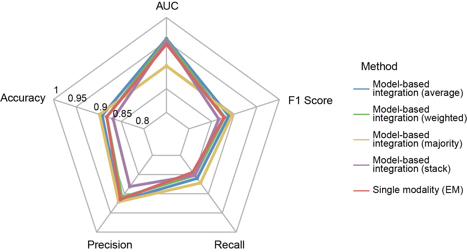
Section 5: Compare the performance metrics of single-modality and multi-modality models
After building the multi-modality model, users want to know if the performance of multi-modality model is improved compared to single-modality model.
Files in the directory output_directory/Machine_Learning/multiple_modality used in this section can be generated by cfDNAanalyzer with the following command :
bash cfDNAanalyzer.sh -I ./example/bam_input.txt \
                      -o output_directory \
                      -F CNA,EM,FP,NOF,NP,WPS,OCF,EMR,FPR,PFE \
                      --classNum 2
                      --cvMulti KFold
                      --nsplitMulti 5
                      --classifierMulti 'KNN'
                      --modelMethod 'average'
                      --transMethod 'pca'
In this section, user can compare the performance metrics of single-modality and multi-modality models. Files output_directory/Machine_Learning/single_modality/EM/single_modality_metrics.csv and output_directory/Machine_Learning/multiple_modality/Concatenation_based/multiple_modality_metrics.csv will be used.
File output_directory/Machine_Learning/multiple_modality/Concatenation_based/multiple_modality_metrics.csv contains the fusion type, fusion method, classifier and feature selection method used, followed by various performance metrics such as accuracy, macro-precision, macro-recall, macro-f1 score, computation time and memory usage (peak memory).
First, load the multi-modality and single-modality metrics data.
library(fmsb)
metrics_df = data.frame()
concat = read.csv("output_directory/Machine_Learning/multiple_modality/Concatenation_based/multiple_modality_metrics.csv")
concat_best = concat[concat$FS_Combination== "filter_SURF_50.0" & concat$Classifier== "XGB",]
concat_best$method = "Concatenation-based_integration"
metrics_df = rbind(metrics_df, concat_best)
metrics_df = metrics_df[, c("auc", "accuracy", "precision", "recall", "f1", "method")]
EM = read.csv("output_directory/Machine_Learning/single_modality/EM/single_modality_metrics.csv")
single_modality = EM[EM$FS_Combination== "filter_FCBF_50.0" & EM$Classifier== "LogisticRegression",]
single_modality$method = "single_modality"
single_modality  = single_modality[, c("auc", "accuracy", "precision", "recall", "f1", "method")]
metrics_df = rbind(metrics_df, single_modality)
Then, visualize the results.
generate_colors <- function(n) {
  if (n <= 15) {
    return(c("#6095C8", "#77BA62", "#E2C66A", "#AA81AF", "#DB6A67", "#8A9CC8", "#E6E1F5", "#C9B8E6", "#A38FCF", "#DB6A67", "#FFD1D0", "#F4A6A4",  "#C04A47", "#A3312E", "#EDBBB9")[1:n])
  } else {
    return(colorRampPalette(brewer.pal(8, "Set2"))(n))
  }
}

metrics_df = as.data.frame(metrics_df)
rownames(metrics_df) <- metrics_df$method
metrics_df$method <- NULL

colors_use <- generate_colors(nrow(metrics_df))

radar_ready <- rbind(
  rep(1, ncol(metrics_df)),
  rep(0.8, ncol(metrics_df)),
  metrics_df
)

colnames(radar_ready) <- c("AUC", "Accuracy", "Precision", "Recall", "F1 Score")

radarchart(
    radar_ready,
    axistype    = 1,
    pcol        = colors_use,
    plwd        = 3,
    plty        = 1,
    pty         = 19,
    pcex        = 2.5,
    cglcol      = "grey70",
    cglty       = 1,
    cglwd       = 1.2,
    axislabcol  = "black",
    caxislabels = seq(0.8, 1, 0.05),
    seg = 4,
    vlcex       = 1.8
  )

  legend("topright",
         legend = rownames(metrics_df),
         col = colors_use,
         lty = 1,
         lwd = 3,
         cex = 1.2,
         title = "Method",
         bty = "n")
Users can get the following figure that compares the performance metrics of single-modality and multi-modality models.
Section 6: Independent Validation Batch effect analysis
In many real-world scenarios, cfDNAanalyzer users want to train a model on one cohort (e.g., a discovery dataset) and evaluate it on an external cohort (e.g., an independent validation cohort or a different sequencing batch).
To assist users, we have:
- Expanded this tutorial to include batch-effect analysis for independent validation;
- Clarified how batch effects influence cross-cohort prediction;
- Added practical guidance for applying cfDNAanalyzer models to external datasets.
Recommended workflow
- Prepare harmonized feature matrices for each cohort.
- Assess batch effects between cohorts (Section 6.1).
- If batch effects are acceptable or at least interpretable, run single- or multi-modality independent validation (Sections 6.2–6.3).
Section 6.1 Batch-effect assessment: PCA + regression on principal components
Before performing independent validation, we strongly recommend assessing whether training and external cohorts differ strongly due to technical factors (batch effects), such as different library preparation protocols, different sequencing platforms / depths, and different pre-processing pipelines.
This section illustrates how to:
Perform PCA on the combined training + external feature matrix and visualize separation along PC1–PC2;
- Fit a multiple linear regression model on top PCs to quantify the contributions of batch (cohort) and disease group;
- Compute a partial R² for batch, i.e., the proportion of variance in each PC that can be attributed to cohort after controlling for disease.
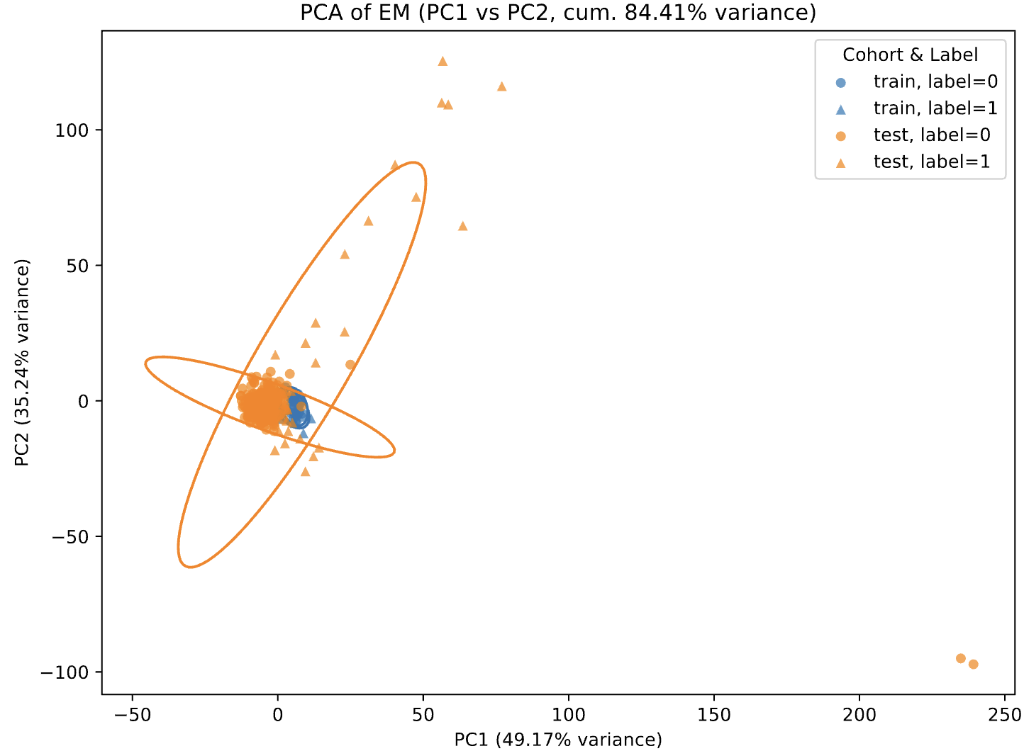
The example below uses End Motif features (EM.csv) but the same logic applies to any other feature type (WPS, NP, PFE, etc.), as long as:
- training and external CSV files share the same set of feature columns;
- both contain a label column and (optionally) a sample column.
PCA visualization (PC1–PC2)
PCA is performed on all feature variables. A PC1 vs. PC2 scatterplot is generated with:
- Color indicating the cohort (e.g., train vs. test);
- Point shape indicating the biological group (e.g., disease class 0/1/2);
- 95% confidence ellipses drawn for each cohort–group combination.
This visualization allows users to quickly evaluate whether different datasets or batches separate in low-dimensional space, providing an intuitive indication of possible batch effects.
Multiple linear regression (contribution of batch vs. disease to PCs)
For the top principal components (e.g., PC1–PC5), the following linear regression model is fitted:
$PC_k = β0 + β1 * cohort + β2 * disease + ε$
where:
- cohort represents dataset or batch (e.g., train = 0, test = 1);
- disease represents biological grouping (e.g., 0/1 or 0/1/2).
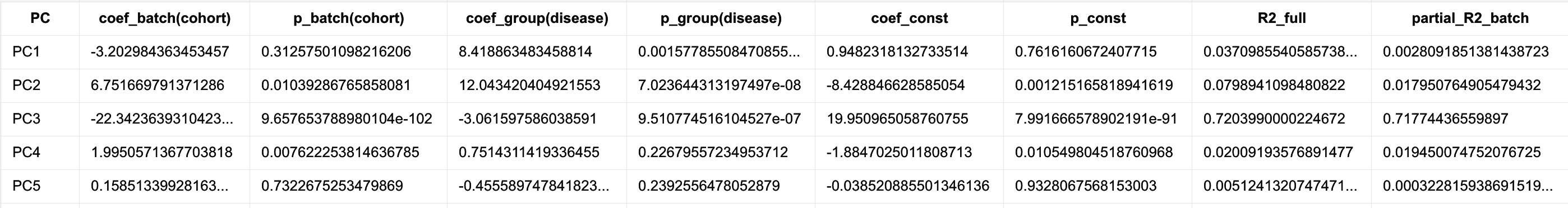
From the regression output, users can inspect:
- coef_batch(cohort) and p_batch(cohort): magnitude and statistical significance of batch effects;
- coef_group(disease) and p_group(disease): effect size and significance of biological grouping;
-
R² and **partial R² (batch disease)**: proportion of variance in each PC explained independently by batch, after controlling for disease.
Integrated interpretation
By combining:
- the PCA scatterplot (PC1–PC2), which visualizes potential cohort or batch separation, and
- the multiple regression results, which quantify batch contributions to each principal component,
users can both qualitatively and quantitatively determine whether a batch effect exists, and how strongly it influences the overall variation structure of their datasets.
Example code: PCA + regression + partial R² (WPS feature)
import os
import pandas as pd
from sklearn.decomposition import PCA
import matplotlib.pyplot as plt
import numpy as np
from matplotlib.patches import Ellipse
import statsmodels.api as sm

# ======== pathway ========
train_path = "/std_train/WPS.csv"
test_path  = "/std_test/WPS.csv"
out_dir = "/WPS_3class_std/"
os.makedirs(out_dir, exist_ok=True)

train = pd.read_csv(train_path)
test = pd.read_csv(test_path)

print("[INFO] Train shape:", train.shape)
print("[INFO] Test shape:", test.shape)

train_cols = list(train.columns)
test_cols  = list(test.columns)

if set(train_cols) != set(test_cols):
    missing_in_test  = list(set(train_cols) - set(test_cols))
    missing_in_train = list(set(test_cols) - set(train_cols))
    raise ValueError(
        f"Train/Test diff!\n"
        f"Train : {missing_in_test}\n"
        f"Test : {missing_in_train}"
    )

test = test[train_cols]

def add_group_column(df, prefix):
    df = df.copy()
    if "label" not in df.columns:
        raise ValueError(f"{prefix} no 'label' col!")
    df["label"] = df["label"].astype(int)
    df["group"] = df["label"].map(lambda x: f"{prefix}_{x}")
    return df

train_tagged = add_group_column(train, "train")
test_tagged  = add_group_column(test, "test")

combined = pd.concat([train_tagged, test_tagged], axis=0, ignore_index=True)
print("[INFO] Combined shape:", combined.shape)

combined_out_path = os.path.join(out_dir, "WPS_train_test_combined_with_group.csv")
combined.to_csv(combined_out_path, index=False)


drop_cols = ["sample", "label", "group"]
feature_cols = [c for c in combined.columns if c not in drop_cols]

X = combined[feature_cols].values

n_components = 10
pca = PCA(n_components=n_components)
X_pca = pca.fit_transform(X)

explained = pca.explained_variance_ratio_
pc1_var = explained[0] * 100
pc2_var = explained[1] * 100
pc3_var = explained[2] * 100
cum2_var = (explained[0] + explained[1]) * 100

print("[INFO] PCA explained variance ratio:")
for i, v in enumerate(explained, start=1):
    print(f"  PC{i}: {v:.4f} ({v*100:.2f}%)")
print(f"[INFO] PC1+PC2: {cum2_var:.2f}%")

pc_names = [f"PC{i+1}" for i in range(X_pca.shape[1])]
pca_df = pd.DataFrame(X_pca, columns=pc_names)
pca_df.insert(0, "sample", combined["sample"].values)
pca_df.insert(1, "group", combined["group"].values)

pca_out_path = os.path.join(out_dir, "WPS_PCA_scores.csv")
pca_df.to_csv(pca_out_path, index=False)
print(f"[INFO] PCA out: {pca_out_path}")

def cohort_from_group(g):
    if isinstance(g, str) and g.startswith("train"):
        return 0
    elif isinstance(g, str) and g.startswith("test"):
        return 1
    else:
        return None

pca_df["cohort"] = pca_df["group"].map(cohort_from_group)        # 0=train, 1=test
pca_df["disease"] = combined["label"].values.astype(int)         # 0 / 1

def plot_ellipse(ax, x, y, edgecolor="k", n_std=2.0, **kwargs):

    if len(x) < 2:
        return

    points = np.vstack((x, y))
    cov = np.cov(points)
    vals, vecs = np.linalg.eigh(cov)
    order = vals.argsort()[::-1]
    vals, vecs = vals[order], vecs[:, order]

    theta = np.degrees(np.arctan2(*vecs[:, 0][::-1]))
    width, height = 2 * n_std * np.sqrt(vals)

    mean_x, mean_y = np.mean(x), np.mean(y)
    ellipse = Ellipse(
        (mean_x, mean_y),
        width=width,
        height=height,
        angle=theta,
        fill=False,
        edgecolor=edgecolor,
        linewidth=1.5,
        **kwargs,
    )
    ax.add_patch(ellipse)

plt.figure(figsize=(8, 6))
ax = plt.gca()

cohort_colors = {
    0: "tab:blue",   # train
    1: "tab:orange"  # test
}


disease_markers = {
    0: "o",
    1: "^",
    2: "s",
}

for cohort_val in sorted(pca_df["cohort"].dropna().unique()):
    for disease_val in sorted(pca_df["disease"].dropna().unique()):
        sub = pca_df[(pca_df["cohort"] == cohort_val) &
                     (pca_df["disease"] == disease_val)]
        if sub.empty:
            continue

        c = cohort_colors.get(cohort_val, "tab:gray")
        m = disease_markers.get(disease_val, "o")

        label_txt = f"{'train' if cohort_val == 0 else 'test'}, label={disease_val}"

        ax.scatter(
            sub["PC1"],
            sub["PC2"],
            label=label_txt,
            alpha=0.7,
            s=30,
            c=c,
            marker=m,
            edgecolors="none",
        )


        plot_ellipse(ax, sub["PC1"].values, sub["PC2"].values,
                     edgecolor=c, n_std=2.0)


ax.set_xlabel(f"PC1 ({pc1_var:.2f}% variance)")
ax.set_ylabel(f"PC2 ({pc2_var:.2f}% variance)")


ax.set_title(f"PCA of WPS (PC1 vs PC2, cum. {cum2_var:.2f}% variance)")

ax.legend(title="Cohort & Label", loc="best")
plt.tight_layout()

fig_path = os.path.join(out_dir, "WPS_PCA_PC1_PC2_with_ellipses_explained.pdf")
plt.savefig(fig_path)
plt.close()
print(f"[INFO] PCA plot: {fig_path}")

# ======== 7. PCk = β0 + β1 * cohort(batch) + β2 * disease(group) + Partial R² ========

pcs_to_analyze = ["PC1", "PC2", "PC3", "PC4", "PC5"]

summary_rows = []

for pc in pcs_to_analyze:
    print("\n" + "=" * 60)
    print(f"[INFO] :{pc} ~ cohort + disease")

    y = pca_df[pc]

    # Full model: PC ~ cohort + disease
    X_full = pca_df[["cohort", "disease"]].copy()
    X_full = sm.add_constant(X_full)
    model_full = sm.OLS(y, X_full).fit()

    # Reduced model: PC ~ disease(remove cohort)
    X_reduced = pca_df[["disease"]].copy()
    X_reduced = sm.add_constant(X_reduced)
    model_reduced = sm.OLS(y, X_reduced).fit()

    SS_full = sum(model_full.resid ** 2)
    SS_reduced = sum(model_reduced.resid ** 2)

    # Partial R² for batch
    partial_R2_batch = (SS_reduced - SS_full) / SS_reduced

    print(model_full.summary())
    print("\n[INFO] Partial R² (batch | group) =", partial_R2_batch)

    summary_rows.append({
        "PC": pc,
        "coef_batch(cohort)": model_full.params["cohort"],
        "p_batch(cohort)": model_full.pvalues["cohort"],
        "coef_group(disease)": model_full.params["disease"],
        "p_group(disease)": model_full.pvalues["disease"],
        "coef_const": model_full.params["const"],
        "p_const": model_full.pvalues["const"],
        "R2_full": model_full.rsquared,
        "partial_R2_batch": partial_R2_batch,
        "SS_full": SS_full,
        "SS_reduced": SS_reduced,
        "n": int(model_full.nobs),
    })

summary_df = pd.DataFrame(summary_rows)
summary_out_path = os.path.join(out_dir, "WPS_PCA_regression_summary_PC_batch_group_partialR2.csv")
summary_df.to_csv(summary_out_path, index=False)
print(f"\n[INFO] output: {summary_out_path}")
print(summary_df)
An example of the output is:
Section 6.2 Single modality independent validation
Once batch effects have been diagnosed and judged acceptable (or at least interpretable), you can perform single-modality independent validation using run_single_independent_validation.py.
This script:
- Loads single-modality datasets from –input_dir;
- Trains models using the selected feature-selection methods and classifiers;
- Supports a special Independent mode for external validation:
- cvSingle = Independent trains on all samples in the training cohort;
- optionally saves the final model for each FS–classifier combination;
- If –external_input_dir is provided:
- applies the trained models to the external cohort;
- outputs predicted probabilities and evaluation metrics for external samples.
Input format
Both training (–input_dir) and external (–external_input_dir) directories should contain:
- One or more .csv files, each corresponding to a single modality (e.g., WPS.csv, EM.csv, NP.csv, …);
- Each file must include:
- label (required): class label (e.g., 0/1/2);
- sample (optional): sample ID; if missing, row index is used;
- all other columns: feature columns.
For a given modality, feature names must be identical between training and external datasets.
Example command: single-modality independent validation
nohup python run_single_independent_validation.py \
  --modality single \
  --input_dir ./train_data_for_independent_validation/WPS/std_train \
  --external_input_dir ./test_data_for_independent_validation/WPS/std_test \
  --classNum 2 \
  --classifierSingle KNN SVM \
  --cvSingle Independent \
  --nsplitSingle 1 \
  --filterMethod IG \
  --filterFrac 0.99999 \
  --embeddedMethod RF \
  --embeddedNum 50 \
  --DA_output_dir ./Independent_validation/single_WPS \
  --save_model \
  > independent_single_WPS.out &
Output structure (single-modality Independent mode)
For each modality
-
internal (Independent mode):
-
/ / /models/ /final_model.joblib (saved model bundle with FS indices and feature names)
-
-
external evaluation (only if external_input_dir is provided):
-
/ /external_eval_probabilities.csv **Per-sample probabilities** on the external dataset, with columns: - SampleID, TrueLabel, FS_Combination, Classifier - Prob_Class0, Prob_Class1, … (up to classNum − 1) -
/ /external_eval_metrics.csv Classification metrics for each FS–classifier combination, including: - AUROC, accuracy, precision, recall, specificity, F1 - (binary) TN, FP, FN, TP - plus any additional aggregated metrics
-
Section 6.3 Multi modality independent validation
For multi-modal integration scenarios, cfDNAanalyzer provides run_multi_independent_validation.py, which implements multi-modality independent validation:
- Training set: –input_dir
- Independent test set: –external_input_dir
- For each configuration, the script performs one full-data training + external evaluation (no internal KFold/LOO inside this script).
Input format
Both training and external directories should contain matching sets of files:
- One file per modality (e.g., CNA.csv, EM.csv, WPS.csv, …);
- Each file includes:
- label (required),
- sample (optional),
- feature columns.
File names (without extension) define the modality names, and feature names must match between training and external datasets.
Example command: multi-modality independent validation
nohup python run_multi_independent_validation.py \
  --modality multi \
  --input_dir ./train_data_for_independent_validation/raw_two/std_train \
  --external_input_dir ./test_data_for_independent_validation/raw_two/std_test \
  --classNum 2 \
  --fusion_type concat model trans \
  --model_method average weighted stack \
  --trans_method pca rbf snf \
  --classifierMulti KNN SVM \
  --cvMulti Independent \
  --filterMethod IG \
  --filterFrac 0.99999 \
  --DA_output_dir ./Independent_validation/multi_fusion \
  > independent_multi.out &
Output structure (multi-modality Independent mode)
All multi-modal independent validation results are saved under: